| Grade | % Mark | Rubric |
|---|---|---|
| A* | 98-100 | Exceptional. Not only was it near perfect, but the graders learned something. THIS IS HARD TO GET. |
| NA | 96+ | You went above and beyond |
| A | 94+: | Everything asked for with high quality. Class example |
| A- | 90+ | The odd minor mistake, All code done but not written up in full sentences etc. A little less care |
| B+ | 87+ | More minor mistakes. Things like missing units, getting the odd question wrong, no workings shown |
| B | 84+ | Solid work but the odd larger mistake or missing answer. Completely misinterpreted something, that type of thing |
| B- | 80+ | Starting to miss entire/questions sections, or multiple larger mistakes. Still a solid attempt. |
| C+ | 77+ | You made a good effort and did some things well, but there were a lot of problems. (e.g. you wrote up the text well, but messed up the code) |
| C | 70+ | It’s clear you tried and learned something. Just attending labs will get you this much as we can help you get to this stage |
| D | 60+ | You attempt the lab and submit something. Not clear you put in much effort or you had real issues |
| F | 0+ | Didn’t submit, or incredibly limited attempt. |
4. Final Project Report UPDATED CODE
THIS CONTAINS MORE SOPHISTICATED CODE THAT DOES THE SAME JOB BUT LOOKS BETTER
In this page there is:
About the report
What to submit/format
What content to include
The grading rubric/checklist
The final dataset, useful code and things we have learned this semester
1. About
CANVAS PAGE HERE: https://psu.instructure.com/courses/2243429/assignments/15012915
Congratulations! You made it to the end of the semester. Thanks for being awesome
Over the last few weeks, we have been working on analyzing and modelling the temperature data. Your job is now to put it all together using the code we have used.
You can EITHER
Work in groups, where you clearly show what each team member contributes. In this case,I expect at least one or two models by each group member and a comparison of their pros and cons.
or individually (attributing any early work created by another team member)
This is worth 50 points. I am grading you on the thoughtfulness and quality of your analysis.There is no “right” answer.
2. What to submit, report format
A .Rmd and a .html file containing your report
To get an A grade, I expect professional formatting, tables of contents, templates, extraneous “welcome” text removed from package loading using code chunk options. Use the templates from previous labs/reports!
3. Content to include
Remember you can use text/figures/analysis from throughout the semester and from all the project discussion boards.
- A introduction about the climate of State College (esp the temperature) - remember Weather Spark!
- To clearly state the aim of the project, which is to predict the coldest location in State College TOWNSHIP, given the calibration data which was placed over the entire area.
- To talk about what might cause temperature differences, using your causal flowcharts.
- To clearly state the object of analysis of the calibration data, and the predictor variables, along with any quality control and data wrangling we have done (it’s OK to talk more generally about the Quality Control rather than every specific sensor removed etc). Remember units! All described with sources here - https://psu-spatial.github.io/Stat462-2023/in_S462_Project03InitialEDA.html
- To create a series of models, check their validity (LINE), discuss the goodness of fit and describe your favorite. Useful code below.
- To decide on your final object of analysis, response variable and predictors, then use that model to predict the location of the coldest temperature on Monday 1st May. Remember you can use the forecast temperature for the future airport temperature! If you can’t make a complex model work for prediction, tell me and then choose an easier one
- For 10 bonus points, to collect a temp sensor from me in Walker 201 in office hours tomorrow, or in Friday’s lecture. Then put it out in your predicted location, recording the Lat/Long and taking some photos & filling in the google form, then bringing back the sensor by the exam. We will see who is correct!
This is not part of the main report & you do not have to talk about the results as it will take me a week to find out the results.
4. Grading Rubric/checklist
See the table below for what this means - 100% is hard to get!
The text below shows what I would expect from such a report.
HTML/RMD FILE SUBMISSION - 5 marks
FORMAT/PROFESSIONAL REPORT - 10 MARKS
Full marks for a report that I would take into a job interview. You lose marks for each thing that makes it look non-professional.
I AM NOT GRADING GRAMMAR ETC. I know some people speak English as a second language. This is not a writing class.
You have done things like fully labeled plots, used mathematical equation formats, sub-headings, used spell check, a theme and as relevant things like tables of contents. You have used photos/pictures as appropriate. You included units and used code chunk options to hide any spurious code output.
In the text, you have written full paragraphs/sentences, explained results in clear language ON THE TOPIC OF TEMPERATURE (e.g.. beyond “reject H0” you have described what this means)
GRAPHICS - 5 MARKS
- You have included maps, summary statistics and scatterplots as appropriate. Your plots look great with professional axes labels and colors. You have tried more sophisticated plots than just the basics (remember ggstatplot!),
INTRODUCTION/DESCRIPTION/QUALITY CONTROL - 10 MARKS.
- You have thoughtfully described the problem, correctly identifying the object/variables AND units! You have explored the causal chain & quality control and it’s clear why you’re choosing your final models.
MODELLING - 10 MARKS
- You created your model correctly and explained why you chose them. In your write up you have summarised the model equation (including the coefficients as numbers) & summarising units afterwards. You have produced a model summary, assessed LINE/outliers and answered all questions as appropriate. It is likely that you used some sort of model selection tool such as Best SubSets.
PREDICTION - 10 MARKS
You have decided on your final model, explained why, checked its validity and used the output map to decide where to put your sensor.
Note, the final prediction is a grid cell! So you should also describe where inside your chosen grid square you will place your sensor (e.g. not in the middle of the I80 or a private house…)
[50 marks total]
Within each section above, I am using this “sub-rubric”
5. Data and useful code
A. Set-up
1st, I strongly suggest using a theme and using an R project. See the earlier tutorials for more.
Also a code chunk at the top, where you can put “include=FALSE” in the code chunk options to hide it. This will remove spurious messages. More info here if you don’t know what I mean: https://rmarkdown.rstudio.com/lesson-3.html
## Global options
rm(list=ls())
knitr::opts_chunk$set(cache = TRUE,message=FALSE,warning=FALSE)
These libraries might be useful.
# Load libraries
library("tidyverse") # Lots of data processing commands
library("knitr")     # Helps make good output files
library("ggplot2")   # Output plots
library("rmarkdown") # Helps make good output files
library("lattice")   # Makes nice plots
library("RColorBrewer") # Makes nice color-scales
library("skimr")     # Summary statistics
library("Stat2Data") # Regression specific commands
library("corrplot")  # correlation plots
library("GGally")    # correlation plots
library("ggpubr")    # QQplots
library("olsrr")     # Regression specific commands
library("plotly")    # Interactive plots
library("readxl")    # Read from excel files
library("equatiomatic") # extract equations
library("ggstatsplot") # Make nice plots
library("visreg") #visualise regression outputs
library("MASS") # Studentised residuals
library("terra") # Spatial
library("sf") # Spatial
library("sp")  # Spatial
library("tmap") # Spatial
library("raster") # Spatial
library("kableExtra") # if you want to make fancy tables
B. Final Calibration Dataset
Put the data into your project library. If I update the dataset, I will update exactly with the same filenames so you can overwrite
C. Reading in the data
Here is how I read in the calibration and prediction data. Units below the code
If you wish to understand the map projection part and why the location is X and Y in metres rather than Long/Lat, see this tutorial. You can read more about the specific projection I chose here, https://epsg.io/32617 (it’s UTM).
#------------------------------------------------------------------------
# CLEAR THE WORKSPACE
#------------------------------------------------------------------------
 rm(list=ls())

#------------------------------------------------------------------------
# LOAD SPATIAL BORDERS
#------------------------------------------------------------------------
 MyMapProjection <- "EPSG:32617" #UTM17
 TrainingBorder <- st_read("TrainingArea.shp",crs=MyMapProjection)
 predictBorder  <- st_read("PredictionBorder.shp",crs=MyMapProjection)

#------------------------------------------------------------------------
# LOAD TRAINING DATA
#------------------------------------------------------------------------
 TrainingData <- read_excel("FinalMidnightData.xlsx")
 TrainingData$TownshipName <- as.factor(TrainingData$TownshipName)
 TrainingData.sf  <- st_as_sf(TrainingData,crs=MyMapProjection, coords=c("X","Y"))

#------------------------------------------------------------------------
# LOAD PREDICTON DATA
#------------------------------------------------------------------------
 PredictionData <- rast("PredictionRaster.tif")

 # Set the map projection.
 crs(PredictionData) <- MyMapProjection

 # Rename so it exactly matches the model. For units & sources, see
 names(PredictionData) <- c("Elevation",
                            "Slope",
                            "Roughness",
                            "Aspect",
                            "LandCover_Code",
                            "NCLD_Percent_Tree_Cover",
                            "NCLD_Percent_Concrete" )

 # Add in the additional columns
 PredictionData$Serial       <- NA # or replace with your sensor's serial number
 PredictionData$Date         <- "2023-05-01"
 PredictionData$Hour         <- TrainingData$Hour[1]
 PredictionData$Minute       <- TrainingData$Minute[1]
 PredictionData$TownshipName <- as.factor("State College")
 PredictionData$Light_Lux    <- 0
 PredictionData$X  <- xyFromCell(PredictionData, 1:ncell(PredictionData))[,1]
 PredictionData$Y  <- xyFromCell(PredictionData, 1:ncell(PredictionData))[,2]

 # YOU NEED TO MODIFY THESE!
 # Change the NA to the forecast weather conditions at the airport at midnight on May-1
 PredictionData$AirportTemp     <- NA # Unit:F
 PredictionData$AirportPressure <- NA # Unit:mbar
 PredictionData$AirportWind     <- NA # Unit: mph
 PredictionData$AirportDir      <- NA # Unit: degrees
 # Hint, see weather underground/accuweather ,
 # or https://forecast.weather.gov/MapClick.php?lat=40.85344&lon=-77.8401

 # Both Predict.df and PredictionData are now identical so your code should still run.
 Predict.df <- PredictionData
C.1 Units/Sources for the data.
Serial: the serial number of the sensor
X and Y. The location of the sensor/predicted point in X and Y metre coordinates
- Note, Long/Lat coordinates are poor over small areas, so I’m using the WGS84 17N / Pennsylvania North map projection (https://epsg.io/32617). If you wish to understand more, see this tutorial.
Elevation_1m: The elevation of the sensor/predicted point to the closest metre from the USGS 1 meter Digital Elevation Model (https://data.usgs.gov/datacatalog/data/USGS:77ae0551-c61e-4979-aedd-d797abdcde0e). I also added in sensor height off the ground
Slope_1m : The slope of the location where the sensor was placed, from the same USGS DEM
Aspect_1m : The aspect of the location where the sensor was placed., from the same USGS DEM
Roughness_1m : The roughness of the location where the sensor was placed, from the same USGS DEM
LandCover_Code: The NCLD landcover code for that location, from here https://www.mrlc.gov/data/legends/national-land-cover-database-class-legend-and-description and automatically downloaded using the FedData package
NCLD_Percent_Tree_Cover: The percent tree cover for that location from the same NCLD database
NCLD_Percent_Concrete : The percent concrete at that location from the same NCLD database
Date: Date of the measurement in yyyy-mm-dd
Hour: Hour of the measurement - should all be at midnight
Temp_F: Unit F. The temperature measurement in F at each training sensor. #
Light_Lux: Unit Lux, The Light measurement at each training sensor. I assumed for prediction that the lux would be 0 (e.g it’s dark at midnight)
AirportTemp Unit: F. This is the temperature at University Park weather station at midnight on each day we took data. (source - http://www.climate.psu.edu/data/ida/index.php?t=3&x=faa_hourly&id=KUNV)
- For prediction YOU NEED TO PREDICT WHAT THIS WILL BE AT MIDNIGHT ON THE 1ST MAY
AirportPressure Unit - mbar: This is the pressure at University Park weather station at midnight on each day. High pressure normally means sunny/warm. Low pressure means rain/cloud. (source - http://www.climate.psu.edu/data/ida/index.php?t=3&x=faa_hourly&id=KUNV)
- For prediction YOU NEED TO PREDICT WHAT THIS WILL BE AT MIDNIGHT ON THE 1ST MAY
AirportWind : Unit, mph. This is the windspeed at University Park weather station at midnight on each day. (source - http://www.climate.psu.edu/data/ida/index.php?t=3&x=faa_hourly&id=KUNV)
- For prediction YOU NEED TO PREDICT WHAT THIS WILL BE AT MIDNIGHT ON THE 1ST MAY
AirportWindDir : Unit, degrees. This is the degree angle that the wind is blowing from at the airport. E.g. 0/360 means from the north, 90 means from the west etc.(source - http://www.climate.psu.edu/data/ida/index.php?t=3&x=faa_hourly&id=KUNV)
- For prediction YOU NEED TO PREDICT WHAT THIS WILL BE AT MIDNIGHT ON THE 1ST MAY
D. Making maps of predictors
It is now very easy to make maps of your predictors. Each predictor has the same column name as the training data, type this to see them
names(PredictionData)This makes four maps of four variables, adds in the locations of the training data and the prediction data in a few color schemes, then plots them together. Play with this all you like to make it unique :)
# This loads elevation, makes a map with transparency 0.7
# then adds borders and the training data. It saves it as Map_Elev
# which I then print using tmap_arrange

Map_Elev <- tm_shape(PredictionData$Elevation) +
                tm_raster(palette=terrain.colors(99),alpha=0.7, style="cont",) +
            tm_shape(TrainingBorder) + tm_borders() +
            tm_shape(predictBorder)  + tm_borders(col="black") +
            tm_shape(TrainingData.sf) + tm_dots()

Map_Green <- tm_shape(PredictionData$NCLD_Percent_Tree_Cover) +
                tm_raster(palette=brewer.pal(7,"Greens"),style="cont") +
            tm_shape(TrainingBorder) + tm_borders() +
            tm_shape(predictBorder)  + tm_borders(col="black") +
            tm_shape(TrainingData.sf) + tm_dots()

Map_Grey <- tm_shape(PredictionData$NCLD_Percent_Concrete) +
                tm_raster(palette=brewer.pal(7,"Greys"),style="cont") +
            tm_shape(TrainingBorder) + tm_borders() +
            tm_shape(predictBorder)  + tm_borders(col="black") +
            tm_shape(TrainingData.sf) + tm_dots()

Map_Rough <- tm_shape(PredictionData$Roughness) +
                tm_raster(palette=brewer.pal(7,"PiYG"),style="cont") +
            tm_shape(TrainingBorder) + tm_borders() +
            tm_shape(predictBorder)  + tm_borders(col="black") +
            tm_shape(TrainingData.sf) + tm_dots()


# Then arrange them together
# You can choose between static maps
tmap_mode("plot")
tmap_arrange(Map_Elev,Map_Green,Map_Grey,Map_Rough)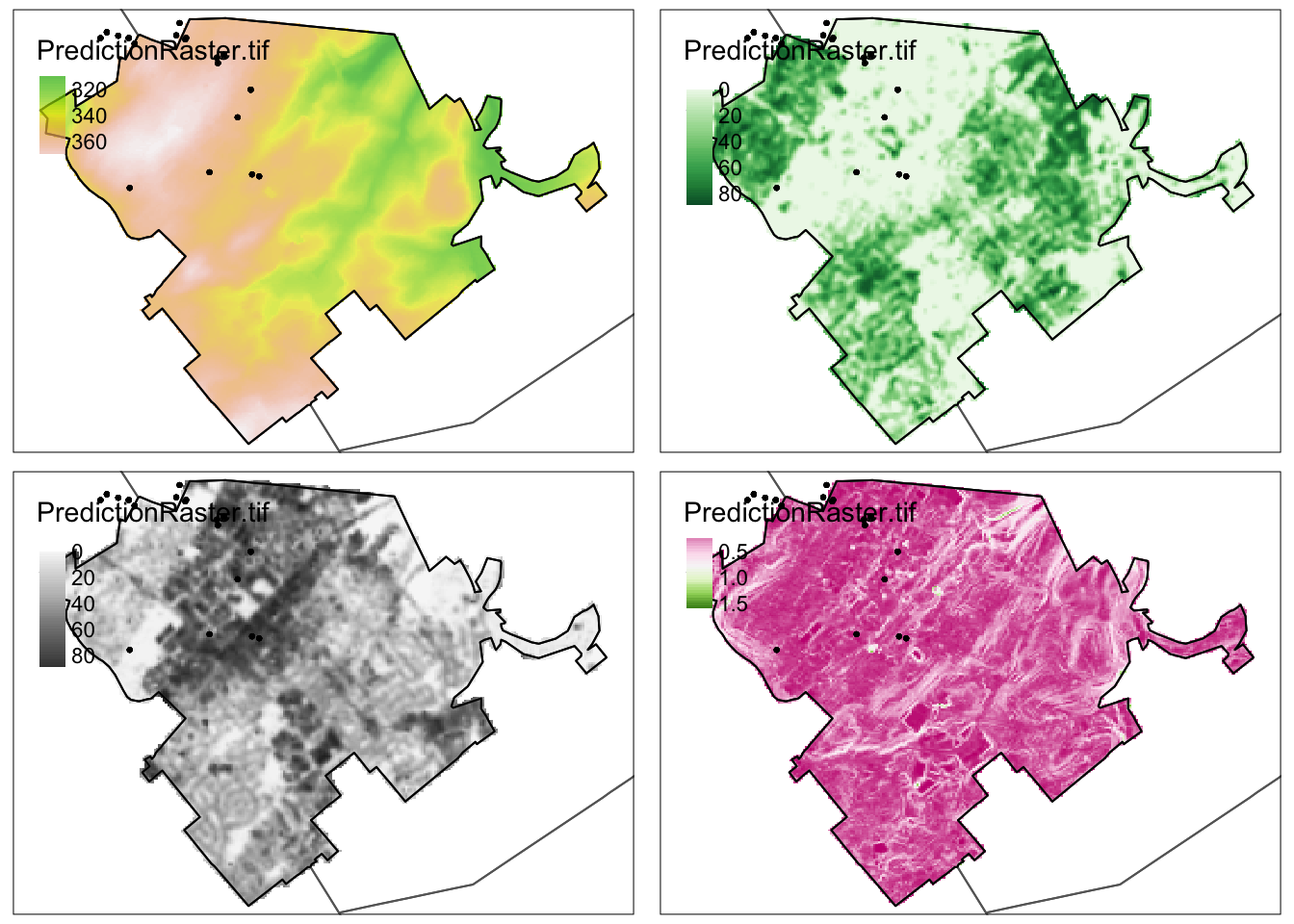
rm(Map_Elev);rm(Map_Green);rm(Map_Grey);rm(Map_Rough)F. Linear model code
For each new model, I normally copy/paste this code and change the model name. I will award bonus points for anyone who makes this into a function.
Making the model
# Make the model
Model1 <- lm(Temp_F ~ X + Y + Elevation, data=TrainingData)

# Model summary or summary(Model1)
ols_regress(Model1)
Extracting the equation
Either copy/paste this output into the text, or in the code chunk options, put {r, asis=TRUE} for it to automatically show up when it knits.
For example this code
# Either type out or use this code to get the equation
equatiomatic::extract_eq(Model1,coef_digits = 5, use_coefs=TRUE)
becomes
# Either type out or use this code to get the equation
equatiomatic::extract_eq(Model1,coef_digits = 5, use_coefs=TRUE)
\[ \operatorname{\widehat{Temp\_F}} = 921.75558 + 0.00174(\operatorname{X}) - 5e-04(\operatorname{Y}) + 0.10327(\operatorname{Elevation}) \]
Checking assumptions
I normally put this stuff in a new code chunk or the ols-summary doesn’t show up properly above
# Plot the residuals.  Check linearity and equal variance.
ols_plot_resid_fit(Model1)
ols_plot_resid_stud(Model1)
ols_plot_resid_stand(Model1)

# Check normality
ols_plot_resid_hist(Model1)
ols_test_normality(Model1)
ols_plot_resid_qq(Model1)

# Check equal variance
ols_test_breusch_pagan(Model1)

#Check for influential outliers
ols_plot_resid_lev(Model1)

# Check for multicollinearity
ols_vif_tol(Model1)
Making maps of residuals and training data
Here are some professional maps I made of the output. I hope this is useful in your future careers!
# You can also look at the residuals and make a map if you like
# No newdata because you're predicting the training data values
TrainingData$Model1Prediction <-  predict(Model1)
TrainingData$Model1Residuals  <-  residuals(Model1)


# Make it spatial
TrainingData.sf  <- st_as_sf(TrainingData,crs=MyMapProjection, coords=c("X","Y"))

# And map. Rather than plotting all at once, I save these 3 maps
# remember to change the column name (dots.col) if you change your response!
# google brewer.pal for more colors

Map_y <- qtm(TrainingData.sf,
    dots.col="Temp_F",
    dots.palette = rev(brewer.pal(7, "Spectral")),
    dots.size=.3,alpha=.5) +
    tm_shape(st_geometry(TrainingBorder))+tm_borders() # add border

Map_yhat <- qtm(TrainingData.sf,
    dots.col="Model1Prediction",
    dots.palette = rev(brewer.pal(7, "Spectral")),
    dots.size=.3,alpha=.5) +
    tm_shape(st_geometry(TrainingBorder))+tm_borders() # add border


Map_Residuals <- qtm(TrainingData.sf,
    dots.col="Model1Residuals",
    dots.palette = brewer.pal(5, "BrBG"), # google brewer.pal for more
    midpoint=NA,dots.size=.3,alpha=.5,
    title="Residuals") +
    tm_shape(st_geometry(TrainingBorder))+tm_borders() # add border

# Then arrange them together
# You can choose between static maps
tmap_mode("plot")
tmap_arrange(Map_y,Map_yhat,Map_Residuals)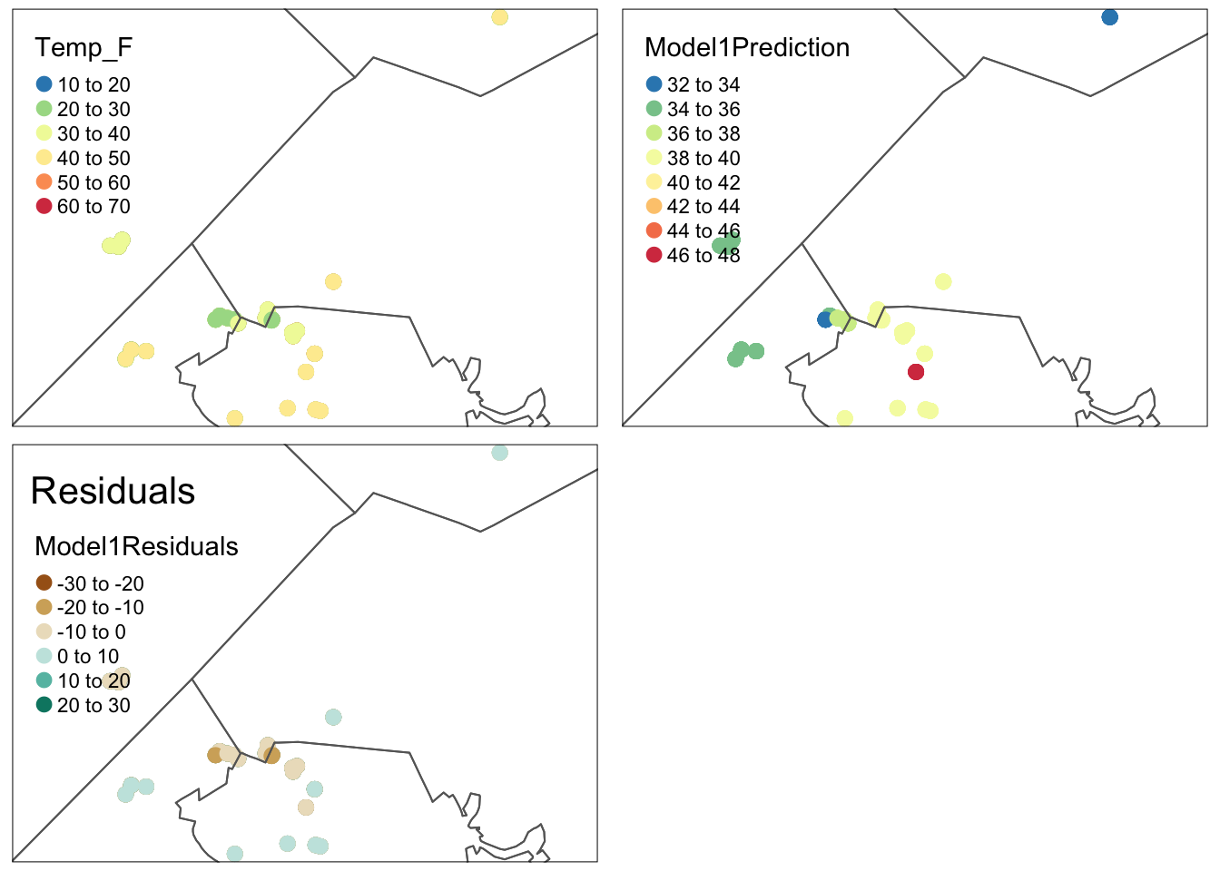
# OR dynamic ones. Don't use both!
tmap_mode("view")
tmap_arrange(Map_y,Map_yhat,Map_Residuals)
# tidy up
rm(Map_y);rm(Map_yhat);rm(Map_Residuals)Comparing models
Let’s say you created Model1 and Model2 above
# To compare models, or use the model summaries.
AIC(Model1,Model2)


# To look at many models, first create a model with all the data
FullModel <- lm(Temp_F ~ .,data=TrainingData)
ols_step_best_subset(FullModel)
Making predictions (UPDATED/EASIER)
We now need to predict the answers to find where to put your temperature sensor. First, add a prediction column to your output.
Note this also works for Predict.df - I made them identical at the top
PredictionData$Prediction <- predict(Model1,newdata=PredictionData)And map
#tm_shape loads a new layer
#tm_raster and tm_lines plots it depending on what type of data you want.

tm_shape(PredictionData$Prediction) +
   tm_raster(alpha=0.7, style="cont",
             palette=rev(brewer.pal(7,"RdYlBu")),
             title="Temperature (F)") +
   tm_shape(TrainingBorder) +
      tm_borders()          +
   tm_shape(predictBorder)  +
      tm_borders(col="red") +
   tm_layout("Prediction for Model 1",inner.margins=c(0,0,.1,0), title.size=.8)
You can also make a map where you identify the coldest locations like this
# Find the cut-off value for the lowest 5% of points
cutoff_5Percent <- quantile(as.points(PredictionData$Prediction),
                              probs = c(0.01), na.rm = TRUE)

# Create some outputs, either a layer
ColdestLayer_5per <- PredictionData$Prediction
ColdestLayer_5per[ColdestLayer_5per > cutoff_5Percent] <- NA
Or select the coldest pixels. This arranges them in order, and then you can select at will.
# or the actual points
lowestpixels <- as.data.frame(PredictionData$Prediction,xy=TRUE)
names(lowestpixels) <- c("X","Y","Prediction")
lowestpixels <- lowestpixels[with(lowestpixels,order(Prediction)),]

lowest100pixels <- lowestpixels[1:100,]
There are a few ways you could visualise this
# And map
tm_shape(ColdestLayer_5per$Prediction) +
   tm_raster(alpha=0.7, style="cont",
             palette=rev(brewer.pal(7,"Blues")),
             title="Temperature (F)") +
   tm_shape(TrainingBorder) +
      tm_borders()          +
   tm_shape(predictBorder)  +
      tm_borders(col="black") +
   tm_layout("Coldest 1% of pixels in Model 1",
             inner.margins=c(0,0,.1,0), title.size=.8)
Or add symbols
tm_shape(PredictionData$Prediction) +
   tm_raster(alpha=0.7, style="cont",
             palette=rev(brewer.pal(7,"RdYlBu")),
             title="Temperature (F)") +
   tm_shape(TrainingBorder) +
      tm_borders()          +
   tm_shape(predictBorder)  +
      tm_borders(col="black") +
   tm_layout("Prediction for Model 1",inner.margins=c(0,0,.1,0), title.size=.8)+
   tm_shape(st_as_sf(lowest100pixels,coords=c("X","Y"),crs=MyMapProjection))+
     tm_dots(col = "red",alpha=.7)
Or both!
# And map
tm_shape(ColdestLayer_5per$Prediction) +
   tm_raster(alpha=0.7, style="cont",
             palette=rev(brewer.pal(7,"Blues")),
             title="Temperature (F)") +
   tm_shape(TrainingBorder) +
      tm_borders()          +
   tm_shape(predictBorder)  +
      tm_borders(col="black") +
   tm_layout("Coldest 20 pixels in Model 1",
             inner.margins=c(0,0,.1,0), title.size=.8)+
   tm_shape(st_as_sf(lowestpixels[1:20,],coords=c("X","Y"),crs=MyMapProjection))+
     tm_dots(col = "red",alpha=.7)
# or to zoom in, switch the order
tm_shape(st_as_sf(lowestpixels[1:100,],coords=c("X","Y"),crs=MyMapProjection))+
tm_dots(col = "red",alpha=.7)+
tm_shape(ColdestLayer_5per$Prediction) +
tm_raster(alpha=0.7, style="cont",
palette=rev(brewer.pal(7,"Blues")),
title="Temperature (F)") +
tm_shape(TrainingBorder) +
tm_borders() +
tm_shape(predictBorder) +
tm_borders(col="black") +
tm_layout("Coldest 100 pixels in Model 1",
inner.margins=c(0,0,.1,0), title.size=.8)