library(tidyverse)
library(dplyr)
library(ggpubr)
library(skimr)
library(ggplot2)
library(ggstatsplot)
library(plotly)
library(ISLR)
library(equatiomatic)
library(olsrr)
library(Stat2Data)
library(readxl)Lab 3: Simple Linear Regression (THIS WEEK)
Welcome to Lab 3
The aim of this lab is to continue to get used to simple linear regression in R.
The Canvas page for this lab is: https://psu.instructure.com/courses/2243429/assignments/14748231
If the labs are causing major problems with your computer or your computer hardware is struggling (or you have any other software issue), Talk to Dr Greatrex and REMEMBER YOU CAN ALWAYS USE RSTUDIO CLOUD.
Getting started
1. Review the Lab Q&A
First, please review the lab Q&A: CLICK HERE. It explains
- What you need to submit, how you are graded and where the rubric is
- The late policy and what counts as cheating
2. Make a new project and markdown file
Follow Tutorial 2 (link working) to create a new project and a new RMarkdown file that knits.
You should now have a new project and a new RMarkdown file that knits.
Create a code chunk near the top and load these packages. You may need to install them first using Tutorial 2.3 (Link working).
3. Code showcase
IF YOU IGNORED STEPS 1 AND 2 ABOVE GO BACK AND DO THEM!
You lose marks for things like no theme, poor headings etc.
3.0 Bonus marks
- This lab is graded out of 70, BUT, there are some bonus marks available (I will cap the lab at 100%). Go to the canvas page here, look at the rubric https://psu.instructure.com/courses/2243429/assignments/14842785# and explain what you would have to do in order to get them.
3.1 LINE Assumptions
- Create a new section called Code Showcase. In your own words, explain the four LINE assumptions (hint See Module 4.1 in Canvas)
3.2 Create your data
Click on the map to create your own dataset which does not break any of the LINE assumptions (you hope!). It should have AT LEAST 30 data points.
Save it to your computer and place it into your Project 3 folder.
3.3 Read the data into R
Read your csv file into R (hint,Tutorial 5, link working)
Use the
nrow()command to prove that your dataset has more than 30 observations/points.
3.3 Read the data into R
Create a quick scatterplot between X and Y, making sure that the response variable is on the vertical axis (hint, GGScatterStats or Tutorial 8, or R-Graph-Gallery).
Create a linear model between X and Y using the lm command (see Tutorial 10, link working, or this tutorial) and save it to a variable called model1
Look at the model summary using
summary(model1), andols_regress(model1).In the text below your summaries, copy in this list and fill in the answers for your particular model.
The Intercept is:
The Gradient/Slope is:
Assume you are looking at the full population. The model equation in symbols is:
- (hint, bonus marks for writing this in equation form)
Assume you are looking at the full population. The model equation, filling in the numbers is
- (hint, bonus marks for writing this in equation form)
The mean squared error is:
The total sum of squares is:
The percentage of variability “explained” by the model is:
4. Houseplant sales [FAKE DATA]

Houseplants are a big deal, especially with the rise of influencers like Phoebe Cheong and PlantKween, Christopher Griffin. But.. unusually, “old fashioned” methods of sales such as mailing leaflets still appear to be popular with many demographics.
You have been hired by a NYC house-plant company, “The Sill” to understand how different marketing campaigns impact sales.
Note, I am only using a real company name so that you can get a better sense of interpreting results. This is all artificial/simulated/fake data from an unrelated maths problem!
Let’s pretend that The Sill has run 200 marketing campaigns over the last few years from 2015-2022, each for a specific plant. For each campaign, they recorded
How much they spent (in units of thousands of dollars) on TV adverts, Social media campaigns and physical mail/leaflets,
How many houseplants were sold (in thousands of plants).
The “X-Factor” of how popular that plant was at the time (percentage popularity)
Typically how tall that type plant was in inches.
Step 4.1
Download the dataset and put it in your Lab 3 folder. There are two ways you can get the dataset:
- Download it directly. Copy/paste this code into R. Note, if you get a weird error, DELETE AND RETYPE EVERY ” QUOTE MARK. Sometimes they copy across wrong.
download.file("https://github.com/psu-spatial/Stat462.data-2021/blob/main/AdvertisingPlant2023.xlsx?raw=true",
destfile="AdvertisingPlant2023.xlsx")- Click on this link: AdvertisingPlant2023.xlsx
Read in the data and explore it. You will find that you have to remove some poor-quality data. There are a few ways to do this:
- Go and remove it from the excel file, make a note of what it was and re-ru
Use the filter command to exclude it. For example, lets say there was a value of -999 in the temperature column of testtable, you could use this command to exclude it
newtable <- testtable[which(testtable$temperature) > -90 , ](or see Tutorial 6 Filter, link checked)
Double check you didn’t just accidentally delete the whole dataset!
Step 4.2
Create a new heading in your report called Houseplant Sales Analysis.
You are writing up your analysis for the CEO of The Sill, Eliza Blank. Using sub-headings, bullet points etc, write a short introductory section which includes:
The object of analysis
A reasonable population this sample dataset is representative of. Could she use this for say 2023 sales? 2040 sales in a new country?
Your response variable.
The variables available for analysis along with their units.
One or two things from your summary analysis, for example, maybe you could talk about the average sales, mention the data you removed or show a histogram / violin plot etc and explain your findings in a few sentences
Essentially, summarise/explain what the dataset shows to The Sill. You are allowed to move any code from section 4.1 to here to make your report flow.
Want an A/A*? Make sure to explain any results in clear English about the actual topic after any statistical output or plots, and to explain any jargon.
- For example, after a statement like “reject the null hypothesis”, you could write a sentence like “In terms of whether you should reject TV advertising, this means…”. Or for your introductory plots, you could write a few sentences comparing the average sales or pointing out features. THESE SECTIONS DON’T HAVE TO BE LONG, but they do have to show me you understand what is going on. Commit to the Bit, pretend you really are delivering the report to The Sill and I promise it will be easier to get through..
Step 4.3 Model analysis
Your client wishes to know which advertising campaign is the most effective out of.
Model1 - Plant Sales vs Mail
Model2 - Plant Sales vs Instagram
For EACH model,
Create a sub-heading
Make a professional scatterplot (see the many tutorials above)
Describe each scatterplot in words (e.g. strength, association, outliers etc).
Create a linear model and show the model summary
Use equatiomatic or any other method to formally write out the equation and coefficients.
Step 4.4 Questions
Explain if you see evidence that the plot might break any of the LINE assumptions
- You can’t just say yes/no, you need to explain your reasons
Out of model 1 and model 2, where do you see the greatest increase in sales if you increase the advertising budget?
- Provide evidence to justify your answer (thinking about uncertainties on your estimate), including the relevant statistics/numbers for each model.
Which model explains the most variability in the sales data?
- Provide evidence to justify your answer, including the relevant statistic/numbers for each model.
In your own words, use the model output and your answers to the questions above to explain to Ms Blank, the pros and cons of using Mail vs Instagram for plant sales.
If instagram-spending doubles, what is your best guess of what would happen to average plant sales?
What is the model estimate of plant-sales when no money is spent on instagram? From what we have learned so far, how could you guess the uncertainty on this estimate (e.g. the range of values).
5. Submitting your Lab
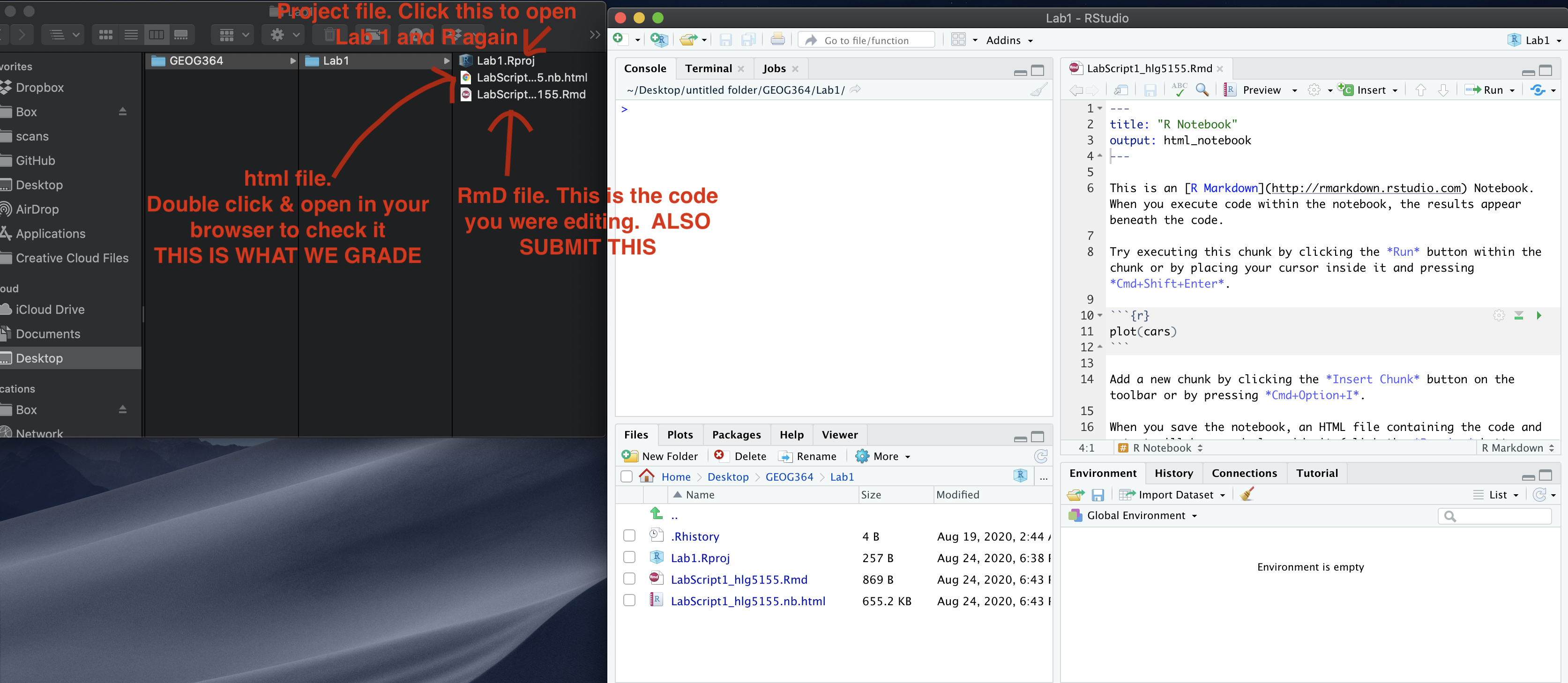
Remember to save your work throughout and to spell check your writing (next to the save button). Now, press the knit button again. If you have not made any mistakes in the code then R should create a html file in your lab 1 folder which includes your answers. If you look at your lab 1 folder, you should see this there - complete with a very recent time-stamp.
In that folder, double click on the html file. This will open it in your web-browser.
CHECK THAT THIS IS WHAT YOU WANT TO SUBMIT.
If you are on R studio cloud, see Tutorial 1 for how to download your files
Now go to Canvas and submit BOTH your html and your .Rmd file in Lab 1.