library(tidyverse)
library(dplyr)
library(ggpubr)
library(skimr)
library(ggplot2)
library(plotly)
library(ISLR)
library(equatiomatic)
library(olsrr)
library(Stat2Data)
library(readxl)
library(tmap)Lab 2: Scatterplots
Welcome to Lab 2
The aim of this lab is to continue to get comfortable in R and to practice the mix of word processing and report editing
The Canvas page for this lab is: https://psu.instructure.com/courses/2243429/assignments/14748231
If the labs are causing major problems with your computer or your computer hardware is struggling (or you have any other software issue), Talk to Dr Greatrex and REMEMBER YOU CAN ALWAYS USE RSTUDIO CLOUD.
Getting started
1. Review the Lab Q&A
First, please review the lab Q&A: CLICK HERE. It explains
- What you need to submit
- How you are graded and where the rubric is
- The late policy
- What counts as cheating
2. Make a new project and markdown file
IMPORTANT! The tutorials are MUCH BETTER - follow and work through Tutorial 2.
You should now have a new project and a new RMarkdown file that knits.
Create a code chunk near the top and load these packages. You may need to install them first using tutorial 2.
3: Code showcase
3A. Adding images
As well as code, I also want you to be able to embed images or videos into your report.
Q1: Follow Tutorial 4b to add images to add an image or video of your choice into your report. (note, non-english characters in file names or huge photos will break R)
Q2. Use a bullet point list (see tutorial 2 visual mode or google) to explain why you chose those photos/images.
3B. Changing the YAML Code
Finally, to make your code look neat, we can edit the “YAML” code at the top. Look at Tutorial 3B - and add a title, author, today’s date (copy/paste the command) and a table of contents if your template does not have one already and allows it.
4: Taiwan analysis
THIS USED TO BE IN LAB 3 - Ignore any lab 3 references
Create a new Level 1 heading called House Prices.
Next month, your friend is moving to Sindian Dist., in New Taipei City, Taiwan. They want to buy a house and have asked you to figure out what most impacts house price.
- Download the “Lab03_house.xlsx” dataset from the Lab page on canvas and put it into your Lab 2 folder. Use the read_excel() command to read it in and save it to a variable called house:
# This only works if you are running your project
# If it can't find the file, use file.choose() to locate it,
# Then add in the full location rather than just the file name.
house <- read_excel("Lab03_house.xlsx")- Explore the dataset (using summaries etc, and by reading more about the data here: https://archive.ics.uci.edu/ml/datasets/Real+estate+valuation+data+set). Describe the dataset to your friend. What columns does the dataset contains and how much data there is? Are there any limitations using this data?
IMPORTANT - WHAT ARE THE UNITS OF THE VARIABLES? WHAT IS THE OBJECT OF ANALYSIS? (Remember to write these in your summary)
Use R to explore the summary statistics and distribution of the House.Price column. What range of costs are “most” of the prices between? (say 68% or the interquartile range..) Is the house price data normally distributed? See the distributions tutorial
You have a been told that houses might be more expensive in the North.
_ Choose your response and your predictor
- Create a scatterplot to assess this (hint: Latitude is the North/South coordinate).
- Describe the scatterplot and describe it as in lectures
- Create a Simple Linear Regression model to assess the issue -TUTORIAL 10 (link updated)
- Plot the abline, or line of best fit onto a new scatterplot (Tutorial 10 again)
Why might this be misleading as an analysis? or why might this model be flawed? What confounding variable could there be? To help you answer this question, try running this code to further explore the data on a map.
You might have to first install the sf package and add library(sf) to your library code chunk (and re-run)
# Command from the sf library
# Make a spatial version of the data using the Longitide and Latitude columns
house.spatial <- st_as_sf(house,coords=c("Longitude","Latitude"),crs = 4326)

# make interactive, for static set as "plot"
tmap_mode("view")


# Command from the tmap library
# and plot
tm_basemap("Esri.WorldTopoMap") +
     qtm(house.spatial, # data
         symbols.col="House.Price", # which column for the symbols
         symbols.alpha=0.9, # transparency
         symbols.size=.2, # how big
         symbols.palette="Spectral", #colors from https://colorbrewer2.org
symbols.style="fisher") # color breaks- What other confounding variables are there? Is there a variable that is more important than latitude in predicting house prices? Provide evidence to justify your answer. To help you answer this data and answer this question, some useful code includes:
- [A] corrplot(). A quick look at the correlation coefficient between all the variables. We will discuss it more next week.
corrplot(cor(house),method="number",type="lower")- [B] If you then want to look at three variables together, you can use an interactive plot e.g you can use this code and change the response, y (currently house price), the predictor x (currently latitude) and the colour (currently distance from the metro station). Have a play and see what variables stand out.
# Create a plot
p <- house %>%
  ggplot( aes(Latitude,House.Price, col= House.Age)) +
  geom_point() +
  theme_classic()+
  scale_color_gradient(low="blue", high="red")

# and actually plot it
ggplotly(p)- You can also use standard scatterplots and regression models if that is easier. Or even excel and screenshots embedded in your report if it is all going wrong!
Your friend forgot to tell you that they love shopping. They only want to live in a house that is close to at least 7 shops, but are worried that they might end up paying too much.
- Filter the data so that it only includes 7 or more nearby shops e.g you’re subsetting by the number of shops column (Tutorial 2C, section 1.8.6). Save the output to a new variable called
house.gt7shop.
- Run a t.test to find out if your house.gt7shop data has a mean that is significantly higher than the mean of the house prices over the whole region (Tutorial 2D, 1.9.2). Remember to write up your hypotheses, the results and the conclusion in plain English that your friend would understand.
- Filter the data so that it only includes 7 or more nearby shops e.g you’re subsetting by the number of shops column (Tutorial 2C, section 1.8.6). Save the output to a new variable called
[OPTIONAL BONUS 2%] How much does the house price go up for every 1 KILOMETER that you travel away from a metro station? Hint(remember the lm command..)
5. Submitting your Lab
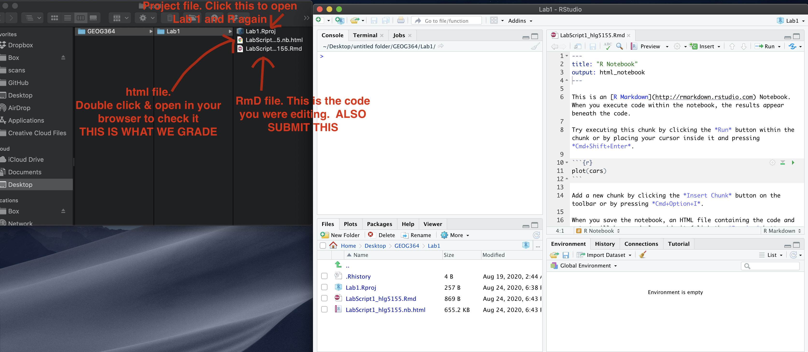
Remember to save your work throughout and to spell check your writing (next to the save button). Now, press the knit button again. If you have not made any mistakes in the code then R should create a html file in your lab 1 folder which includes your answers. If you look at your lab 1 folder, you should see this there - complete with a very recent time-stamp.
In that folder, double click on the html file. This will open it in your web-browser.
CHECK THAT THIS IS WHAT YOU WANT TO SUBMIT.
If you are on R studio cloud, see Tutorial 1 for how to download your files
Now go to Canvas and submit BOTH your html and your .Rmd file in Lab 1.