Lab 3: Spatial Basics
Welcome to Lab 3!
Aim of the lab
Practice setting up and managing a structured RStudio project using spatial and non-spatial data
Use exploratory data analysis (EDA) to summarise and interpret real-world housing data for a non-technical audience
Define and explain core data concepts: object of analysis, variables (with units), population, sampling frame, and representativeness
Convert tabular data into a spatial format using coordinates, and describe spatial attributes such as data type and spatial fallacy risks
Create both quick and professional-quality spatial visualisations using tmap
Develop confidence in communicating data insights through clear language, maps, and plots tailored to an end user (your friend)
Getting help
- Kiely (and often Dr G) will be present during your lab sessions. This
is the easiest way to get help.
- There is a Piazza discussion board. Kiely will explain more in this
week’s lab and will check it at least once a day.
- Dr G has weekly office hours and genuinely enjoys helping with R, even
if you feel stuck or overwhelmed.
- If you have posted on Piazza and received no response after 24 hours,
you may send a Canvas message to Kiely or Dr G (or if you are completely
lost).
Set-up. DON’T SKIP!
Create a project & get the data
There are two options here depending on whether you are using R-studio on the website (posit cloud) or your own computer (R-Desktop). If you are using a lab computerm choose the R-Desktop route.
Option 1. Posit Cloud Website Users
Task 1. Get the data from Canvas
Go to the Lab 3 Canvas page and download the dataset
Lab03_house.xlsx
Task 2. Create a project for Lab 3 (expand for instructions)
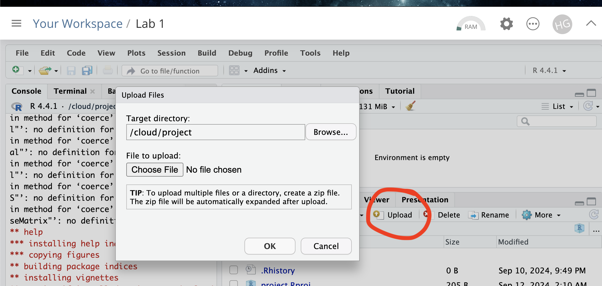
Task 3. Upload your dataset to the website. (expand for reminder)
Task 4. Install more packages (expand for instructions)
Unfortunately on the website you need to install your packages each
time.
Go to to the packages tab, click install to get to the
app-store and download/install these packages:
readxlviridisggstatsplotterratigristidyversedplyrtmapelevatrosmdataggplot2ggthemesRColorBrewerplotlycols4allshinyjs
We will also need a package called sf, which runs a lot of the spatial commands in R. Unfortunately, posit cloud sometimes has a few technical issues with sf, so you will need to run a special command.
IN THE CONSOLE, run these two commands.
install.packages("remotes")
remotes::install_github(repo = "r-spatial/sf", ref = "93a25fd8e2f5c6af7c080f92141cb2b765a04a84")
T6_Packages.html
Reminder: Tutorial:
Packages cheatsheet.
Option 2. R-Desktop Users
Task 1. Create a project for Lab 3
Task 2. Get the data & put in your Lab 3 folder
Go to the Lab 3 Canvas page and download the dataset
Lab03_house.xlsx. Put it in your lab 3
folder.
Task 3. Install some packages
We need to install some more packages.
Go to to the packages tab,
click install to get to the app-store and download/install these
packages. If your computer says its missing a package later on, install
anything it suggests.
elevatrosmdatacols4allshinyjs
Remember DO NOT put install.packages() into your
lab-script - copy and paste it into thee console.
Reminder: Tutorial:
Packages cheatsheet.
Set-up your Lab 3 report
You are welcome to use/edit the template you made in lab 2. If you are unsure what I mean by that, follow these instructions.
Task. Create your RMarkdown file - expand & look at Tutorial 4B and 4C
Task. Edit your YAML code
Lets use similar options to Lab 2, although you could try a different theme. Remember YAML code is annoying to edit, because here, spaces really do matter. Everything has to be perfect or it won’t knit.
Select everything in my code chunk here and replace your YAML with this (remember the — on line 1 and at the end).
Now edit the author name to your own. If you wonder what Sys.Date() is, don’t touch it - it automatically gives you the current date.
Task. Change the theme and knit
In the YAML code, change the theme to any one of your choice that
isn’t not lumen (see here to view available themes - https://bootswatch.com/.).
Some might not work, but these are likely to: “default”, “bootstrap”, “cerulean”, “cosmo”, “darkly”, “flatly”, “journal”, “lumen”, “paper”, “readable”, “sandstone”, “simplex”, “spacelab”, “united”, “yeti”.
Task. Clean the file and create/run your library code chunk
Click on your lab script (the Rmd file) and delete all the ‘welcome text’ after line 11.
Press enter a few times and make a new level-1 heading calledSet Up.We should have all the packages we need installed, but we need to open them. Make a new code chunk containing this code.
library(readxl)
library(tidyverse)
library(dplyr)
library(terra)
library(sf)
library(tmap)
library(elevatr)
library(osmdata)
library(ggstatsplot)
library(ggplot2)
library(ggthemes)
library(viridis)
library(RColorBrewer)
library(plotly)
Press the green arrow on the right of the code chunk to run the code inside it. You will see a load of “loading text” telling your details about the packages you just loaded.
Press the green arrow AGAIN. The text should disappear unless there is an error.Note, remember to run this code chunk EVERY TIME your start R-Studio (in the same way you need to click on an app on your phone before you can use it).
Task. Add warning=FALSE and message=FALSE to your library code chunk.
- Expand here for a tutorial.
Check your progress
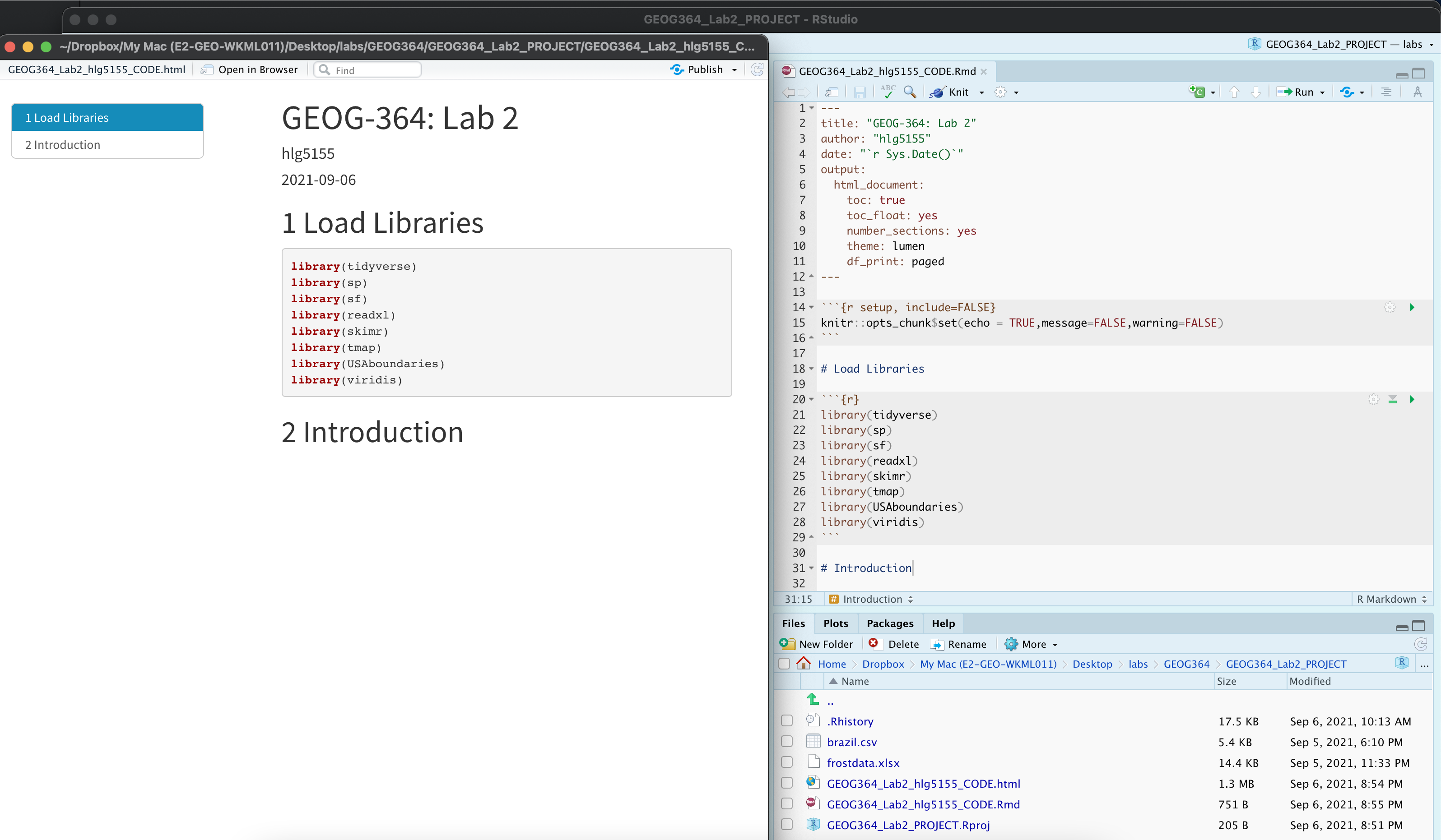
Your lab script should now look similar this, but with your theme and YAML options of choice (you might have a few different libraries than in my screenshot). You should also be able to knit it successfully. If not, go back and do the previous sections!
Moving to Taiwan
The aim of EVERY LAB is to get comfortable writing up analyses of a complex dataset for a specific person or user. The modelling steps may be similar across labs, but the topic and context will vary—so you’ll need to think carefully about what matters in each case.
WEEK 1
Your friend is about to move to Sindian District in New Taipei City, Taiwan. They’re thinking about buying a house—and they’ve asked for your help figuring out what affects house prices in the area. This matters a lot because housing costs have soared in recent years: Who can afford to live in Taipei?
Luckily, you’ve found a dataset, Lab03_house.xlsx, to
help. This is real-life data, described in detail here: UCI
Real Estate Valuation Data Set
Your Goal
To understand which factors influence house prices in Sindian District, New Taipei City, Taiwan, and communicate your results to a non-technical reader.
You are writing the rest of this report for your
friend!
Make sure to explain your findings clearly. Your friend doesn’t study
data science or geography, so use language that they can understand and
explain any jargon.
Summary analysis
- In your report, create a new Level 1 heading called
House Prices.
Remember that you can click Visual mode and use the menu to do this, or put a single # at the front.
- Check you are running your project
Before doing anything else, make sure:
- You are running this lab inside your Lab 3 RStudio project
Lab03_house.xlsxis saved/uploaded in your Lab 3 project folder next to your lab report.
If not, go back to the setup section of this lab before continuing. The code below will not work until your project and files are properly set up. Also remmeber that you need to open your lab 3 project every time you reopen R-studio.
- Read in the data using read_excel()
Once you’re ready, make a code chunk and write a line of code that
uses read_excel(FILENAME) to read the Excel file into R,
and assign/save it a variable called house.
Expand here for a tutorial on how to do this - scroll down to section 1.4
🔍 Reminder This command will only work if you have already run the library code chunk that loads the readxl package - and you need to re-run the library code chunk every time you open R.
- Summarise the data for your friend using code, plots and words
Your goal here is to use R summary commands and plots, along with the background reading, to explore and describe your dataset for your friend. You want to help them understand what yor does (and doesn’t) include, and to explain what it can tell them about house prices in New Taipei City.
If you haven’t already, start by reading the dataset description here: Real estate valuation data set – UCI
In your report, use command like
summary()ORskim()(or others!) to explore the house data. See the tutorials below.Underneath the code chunk in your reports, write a short section that describes the dataset in clear language for your friend. This should must include:
- The object of analysis:
What does each row in the dataset represent? - A list of the variables AND THEIR UNITS:
Briefly describe each column in the data, including what it measures and the unit (e.g., meters, years). Remember the dataset description website… - The ‘strict population’ (sampling frame):
If you were being really strict, what does this sample cover. - A reasonable, justifiable target population:
Based on this sample, what group do you think the data can reasonably be used to represent? - A clear, professional-looking histogram of house prices in a new
code chunk:
See the tutorials below - Summary statistics of the variables, explained in context for your
friend:
Choose a few key variables and explain what the numbers in the summary mean for your friend. For example, can they walk to the station from most places? Are most of the homes near shops? What range of prices are there? - Note any data limitations: For example - spatio-temporal coverage? sample bias? missing variables? other things?
- Overall, summarise if you think the sample is representative of your friend’s needs.
- The object of analysis:
Expand here for a tutorial on how to summarise data. Click section 2.3
Expand here for a tutorial on how to make histograms. Click section 2
Making your data “spatial”
- Make the data “spatial”.
Unlike standard statistics, our data also has spatial characteristics. At the moment, R doesn’t ‘understand’ that the data is spatial. In this section we force R to view the data as spatial.
Make a new heading called spatial analysis in your report
First, we need to know the COLUMN NAMES of the x and y coordinates (case sensitive). The easiest way to get these is to make a new code chunk and run this command.
- We can now use the st_as_sf() command to make a spatial version of the data. Because we’re using the sf package to do this, I have named the resulting dataset house_sf(). Make a new code chunk, copy in the code below and change “X_COLUMN_NAME” and “Y_COLUMN_NAME” to the appropriate column name from your data.
# Hint, the y direction is Latitude..
house_sf <- st_as_sf(house,coords=c("X_COLUMN_NAME","Y_COLUMN_NAME"),crs=4326)
Lets see what you did. In the environment tab, click on the NAME house_sf, or in the console type View(house_sf). You should open a new tab with the spreadsheet. Note that the longitude and latitude columns have disappared! They have been replaced by a geometry column which understands that we are looking at point data.
Equally, in a new code chunk, type house_sf (by itself) and run. You will see a summary of the data including its spatial attributes (map projection, bounding box..)
- Explain the spatial attributes
Below this code, answer these questions
Explain if your data is being represented as a vector (and what type) or raster. Discuss if this is true in real life and if this representation is appropriate for the reason you need the data.
Do you need to worry about the locational fallacy in this case? Explain your answer to your friend.
- Make some quick maps.
There is a quick way to check your data was read in correctly. Make a map! The quickest way to do this is using the qtm command.
Make a new section called maps
Try each of these commands in a new code chunk for each. They should show you some nice maps over Taiwan.
If your data looks weird, you probably mixed up long and lat. Go back to the previous step, change it and rerun - or ask Kiely!
#Set the mode to "view" for an interactive map
tmap_mode("view")

# Make a "quick thematic map" of the house data
qtm(house_sf)
You can also have a look at variables. For example:
If you hate the interactive-ness, change tm_mode to “plot” (but you lose the background map).
# Change the mode to "plot" for a static map
tmap_mode("plot")

# Re-run the same qtm() command to produce a static version
qtm(house_sf,fill="House.Price")
We will make a better static map below!
Making better maps
QTM is great for quick looks, but in terms of making professional output, it can be hard to get it to look really good. So here’s how to make professional looking maps of your output that you can use in a pdf or printout.
The tmap package
The first thing to know is that tmap is currently going through a HUGE revamp. Code that used to work for “version 3” is being switched to “version 4”. I think I have all of it, but if you see warning messages, you can either ignore them or ask chatgpt what the updated code is.
- This is a fantastic guide: https://r-tmap.github.io/tmap-book/layers.html
- And a very detailed textbook: https://tmap.geocompx.org/nutshell
In tmap, we build maps in LAYERS. We connect each layer with with the
+ sign - First, we choose the dataset we want using tm_shape(),
-
Then we choose how to represent it (e.g. dots for points, raster for
grids, polygons for areas)
- Then we can add overall map layers like
legends or basemaps.
- Get the basic tmap code running
- Make a new code chunk and copy and run this code. Although the structure is there, I PURPOSELY chose settings that made the map look terrible! In the next step, you will fix this. In this step, I want to make sure you can get the code to run.
# A better static map
# set up a color scale for your variable
distance_color_scale <- tm_scale_intervals(values = "brewer.blues", style = "equal")

# and plot
tmap_mode("plot")
tm_shape(house_sf) +
  tm_dots(
    fill        = "Distance.Station",
    size        = 6,
    fill.scale  = distance_color_scale,
    fill.legend  = tm_legend("Title?? Units??")) +
tm_basemap(server = "CartoDB.VoyagerNoLabels")- Make a better map in tmap
- Expand the tutorials below to understand how to modify the code.
- Then make a BETTER static map than the one above for the DISTANCE TO
THE STATION for each house.
- It should be:
- Useful for your friend to see the distance to the station for each
house.
- Contain some useful background map to help you assess the
pattern/process
- Colorblind friendly
- Have your own personal stamp on it!
- Useful for your friend to see the distance to the station for each
house.
If you don’t like my tutorials, also have a look at https://r-tmap.github.io/tmap-book/layers.html
Expand here for a tutorial on tm_scale_intervals
What tm_scale_intervals() does
tm_scale_intervals() tells R how to cut your data into
classes and which color palette to use.
For example:
- tm_scale_intervals() : the name of the command
values = "viridis": use the viridis color palettestyle = "jenks": use the jenks technique to split the data into intervals
Choosing a style
Styles listed roughly from most to less common. All create intervals in different ways—try a few to see what looks best. There’s no single “right” style—experiment and pick the clearest map.
- jenks – natural clusters (great first try for environmental or socio-economic data)
- quantile – same number of features per class (good for highlighting rank)
- equal – equal-width ranges (good if data are fairly uniform)
- pretty – nicely rounded numbers (simple readable map)
- fixed – you set the breakpoints (e.g. policy thresholds)
- sd – classes by standard deviation from mean (emphasises difference from average)
- kmeans, hclust, bclust – cluster-based (useful for complex distributions)
- fisher – another algorithm for natural breaks
- dpih, headtails, log10_pretty, cat – special cases (e.g. heavy tails, log scale, or already-categorical data)
Colour palettes
There are MANY palettes; just type the name in
values = "palette_name". Good defaults:
"viridis", "plasma", "cividis",
or any RColorBrewer name like "brewer.blues".
For more choice and built-in colourblind checking, we can use the new cols4all package.
- IF YOU DIDN’T ALREADY, go to the Packages tab, click install and
install
cols4allandshinyjs. - Now go to your library code chunk at the top, add
library(cols4all)and run the chunk. You don’t need to add shinyjs as it runs in the background. - IN THE CONSOLE, type
c4a_gui()and press enter.
This will open an interactive palette browser where you can check out
different palettes and assess their color-blindness properties. Pick a
palette name and use it in values.
Remember to consider if your data is naturally SEQUENTIAL, DIVERGING, or CATEGORICAL and to choose accordingly (https://www.datawrapper.de/blog/diverging-vs-sequential-color-scales)
Expand here for a tutorial on tm_scale_intervals
tm_shape(house_sf) – tells R which
spatial dataset you want to plot. It sets up the base layer (in this
case, your points).
Each tm_shape() refers to a different spatial object
(points, polygons, etc.), and the command that follows it (like
tm_dots() or tm_borders()) tells R how to
visualise that layer. This gives you flexibility to build up your map
one piece at a time.
You must always use tm_shape(DATASET) before adding any
new data.
Structure tip: You can stack multiple layers using
more than one tm_shape() block. For example:
# Multiple shapes example with fake data. the first is line data,
# the second points where we want to color them in by a variable
# we will do more of this next week
  tm_shape(DATASET1) +
     tm_borders() +
  tm_shape(DATASET2) +
      tm_dots(fill = "Distance.Station") +
  tm_basemap(server = "CartoDB.Positron")
tm_dots(...) – This adds point symbols
to the map for each feature in house_sf. You can customise
how these look:
fill = "Distance.Station"– the variable used to colour the points. This must be numeric or categorical.size = 6– sets the size of the point symbols. Try values between 0.1 and 8 depending on how crowded the map looks.fill.scale = distance_color_scale– tells R which palette and classification system to use. This object should be created withtm_scale_intervals()- see previous tutorial!fill.legend = tm_legend("Distance to station (km)")– adds a clear legend title. Use something meaningful with units.
There are MANY more options for dots. Like transparancy, borders, shapes.. ChatGPT, google or the tm_dots help file are all useful here. e.g. in the console type ?tm_dots
tm_basemap(server = "CartoDB.VoyagerNoLabels")
– This adds a clean background map for geographic context. This version
has no labels, which is useful if your points are dense or you plan to
add your own labels. Basemaps come from online tile providers and help
you see where your data is located in the world.
Common basemaps you can try:
"CartoDB.VoyagerNoLabels"– light grey map, no labels (good for layering your own info)"CartoDB.Positron"– very light, minimal map (excellent for visual clarity)"CartoDB.DarkMatter"– dark background for contrast with bright points"Esri.WorldGrayCanvas"– Esri’s clean grayscale map (useful for presentations)"Esri.WorldImagery"– satellite imagery (be careful: may be visually overwhelming)
To use any of these, just change the server
argument:
You can leave out the basemap if it distracts from the data or if you’re using a local projection.
Common extras you can add to the map:
tm_compass(position = c("right", "top"))– adds a north arrow.tm_scalebar(position = c("left", "bottom"))– adds a scale bar.tm_layout(frame = FALSE)– removes the black frame around the map.tm_credits("Your Name or Source", position = c("LEFT", "BOTTOM"))– adds a small credit or caption.
You just add these as lines to the end, linked with a + e.g.
# and plot
tmap_mode("plot")
tm_shape(house_sf) +
  tm_dots(
    fill        = "Distance.Station",
    size        = 6,
    fill.scale  = distance_color_scale,
    fill.legend  = tm_legend("Title?? Units??")) +
tm_basemap(server = "CartoDB.VoyagerNoLabels")+
tm_scalebar(position = c("left", "bottom"))
Again, I only know about half of tmaps functionality. There are more things like better titles, labels, grids.. anything you can do in arcmap. So use chatGPT, google, any resource you can find and as a class we can build our knowledge of how to easily make beautiful maps.
Here is my current example for house price.. (code hidden but all based on things in the tutorial)

WEEK 2
Tidying your reports
Dr G: After reviewing your earlier lab submissions (grades coming this week), I noticed that many of you are missing some very easy things that would make your reports look a lot more professional.
So, I’m going to list those things clearly here. From this lab onwards, you’ll start losing style points if they’re missing — not because I’m being picky, but because they’re quick fixes!
1. Delete the starter text each time you create a new Markdown file
Every time you make a new R Markdown file, RStudio automatically fills it with some example text as shown in the figure below. You never need this! Think of it like this: imagine opening a new Word document, and it already had a paragraph saying, “Hi, this is Microsoft Word! Here’s how you make text italic…” — you’d delete that before writing your paper. Same idea here.
SO BEING CAREFUL TO NOT DELETE THE YAML CODE AND TOP CODE CHUNK, scroll to the top and delete the starter text. You never need it! Scroll to the top of your reports now and make sure it’s gone.

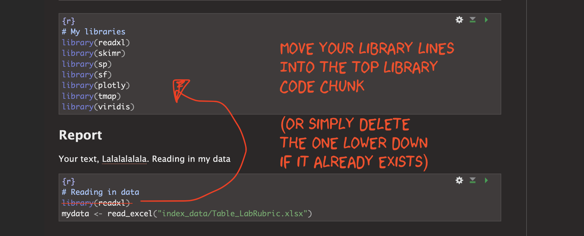
2. Move all your library commands to the top
You should always have a code chunk near the top of your script that contains all your library() commands. Running this chunk is like pre-loading all the apps your report will need to work properly. Lately, I’ve noticed that many of you are starting to use ChatGPT — which is great! — but it often gives instructions that include the library() command right along with the code you’re copying. That means you’re pasting library() into lots of different places in your report.
From now on: the only place you should put library() commands is in your ‘library’ chunk near the top. If you run each time you open Rstudio, all your packages will be loaded for the entire RStudio session. SO NO LIBRARY() COMMANDS BELOW THAT POINT!
This is good practice because it makes your code easier to read, avoids repetition, and helps others (including me!) see all the libraries/apps you use in one place. It also means that it’s easy to work out the difference between an error with your code vs an error with the underlying package that loads it.
So go through your report now. Every time you have used the library(..) lower down, move it to the library command at the top (or delete if you have already loaded that library)
3. Remove View() and other interactive commands
R includes some great interactive commands. For example:
View(house)opens your data in a new tab so you can look at itfile.choose()lets you browse your computer to find a file
These are very helpful while you’re working — and R will often suggest them.
But they can cause problems when you knit. When you click Knit, you’re asking RStudio to turn your work into a webpage or PDF. If your code includes an instruction like “open a new tab to show the data”, it may crash the knitting process — or just silently fail.
So: don’t leave interactive commands in your final report! If you need them while working:
- Type them into the console
- or run them, then delete the line
- or (for View()), just click the object’s name in the Environment tab
Knit-friendly reports should run start to finish without needing you to click or respond to anything.
4. Use headings and sub-headings
In my instructions, I usually only ask you to include the basic top-level headings.
But the more structure you add, the easier it is to navigate your report — especially using the table of contents, which lets us jump straight to each section. This makes your work much easier to grade. Imagine how untidy these instructions would be without headings and subheadings.
So think about what sub-headings might help. You could:
- add one for each question
- break up a long explanation when you’re talking to your friend about Taiwan
- separate different steps in your analysis

Add Raster Elevation data
OK! Now your reports are back in shape, lets continue to add more information about your Taiwan example.
In our world of big data, we have access to a LOT of raster (gridded) datasets. Today you will download fine scale elevation data for the whole region. The code to do this is very easy from the elevatr package:
STEP 1 - Check the library
Go to the library code chunk. Make sure library(elevatr)
exists and that the code chunk runs.
- If it’s not there, type it in and press run (check the spelling!)
- If it says the package doesn’t exist, go to the Packages tab, and click install to go to the app store. Install, then re-run the library code chunk.
STEP 2 - Download the elevation for your area
Scroll back to the end of your report (maybe make a new sub-section..) and make a new code chunk.
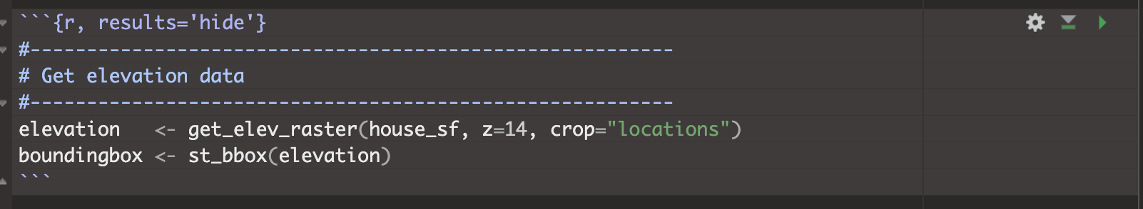
Then type/copy this code EXACTLY. Making sure to ALSO adjust the code chunk options at the top! If you miss the results=‘hide’, your final report will be full of 100 “elevation downloading warning messages”. Now run the code chunk, it might take a little while to run.
STEP 3 - Look at the data
Make a new code chunk and just type in the word elevation and run the chunk. It should give you a summary of your elevation dataset.
Also make a very basic plot by typing plot(elevation) and running the code chunk.
You are going to make better maps later in the lab.
STEP 4 - Explain what you did
Your friend is interested in the coding process! Explain to them in CLEAR langauge exactly what you just did, including
- What does the get_elev_raster command do?
- What does z = 14 mean?
- What does crop=“locations” mean?
- In the summary, how many grid-cells are there?
- What units are the extent/projection in?
Use google to help! And use the get_elev_raster help file by typing ?get_elev_raster into the console and pressing enter
OPTIONAL, for a detailed tutorial, see https://rspatialdata.github.io/elevation.html
Add Open Street Map Data
In the last year or so, it has also become possible to access the VAST amount of data from Open Street Map. It’s a little bit clunky to access, but with ChatGPT (or your AI of choice) helping, its not too hard.
STEP 1 - Check the library
Go to the library code chunk. Make sure library(osmdata)
exists and that the code chunk runs.
- If it’s not there, type it in and press run (check the spelling!)
- If it says the package doesn’t exist, go to the Packages tab, and click install to go to the app store. Install, then re-run the library code chunk.
STEP 2 - Download railways for your area
Scroll back to the end of your report (maybe make a new sub-section..) and make a new code chunk.
Today we are going to download railway data, but know that you can download ANYTHING you can find on open street map (from fire stations, to cyber cafes, to graffiti locations).
Type/copy this code EXACTLY to get the railway data. Now run the code chunk, it might take a little while to run. It will ONLY work if you have run the elevation code chunk above.
#---------------------------------------------------------
# Get Railway tracks as lines from open street map
#---------------------------------------------------------
boundingbox <- st_bbox(elevation)

all_raildata <- opq(bbox = boundingbox) |>
  add_osm_feature(
    key = "railway",
    value = c("rail", "light_rail", "subway", "tram", "narrow_gauge", "monorail")) |>
  osmdata_sf()

railways <- all_raildata$osm_lines
STEP 3 - Edit the code to download major roads
Now, I want you to edit this command to download major road data. To do this.
A. Make a new code chunk and copy/paste the full railway command into
it (everything above)
B. Everytime the code mentions rail in
the variable names etc, switch to road.
C. Instead of
key = "railway" , you need
key = "highway"
D. Instead of
value = c("rail", "light_rail", "subway", "tram", "narrow_gauge", "monorail")) |>
,
you need value = c("primary")) |>
E. Run and it
shouldn’t give an error.
STEP 4 - Explain what you did
Your friend is also curious about this code.
- Tell them what OpenStreetMap is (and why it’s cool) - use google!
- Explain this bit of the code e.g. what are the keys and
values…
add_osm_feature( key = "railway", value = c("rail", "light_rail", "subway", "tram", "narrow_gauge", "monorail")) |>
These might help, and you are welcome to use AI to help, but you need to write your answer in your own words.
- https://wiki.openstreetmap.org/wiki/Tags
- https://wiki.openstreetmap.org/wiki/Map_features
- https://taginfo.openstreetmap.org/
Show me something new!
Labs are designed to be hard to get 100%! So this challenge is to push people who are finding it easy for those final 4 marks.
**CHALLENGE: Copy my code above into a new code chunk then edit, to download ANYTHING else from Open Street Map and add it to your maps below.
- You get 2 marks for any attempt here, or even explaining what you tried to do if it didn’t work.
- You get 3 points for relevant line data
- You get 4 points for relevant point/polygon data
HINTS
- Hint 1, I’m extracting LINES for roads and railways in the final line of the code chunk.
- Hint 2, Think of things that might actually be in this area. You could always go here, zoom in to Taipei and take a look https://www.openstreetmap.org/. If you get an error it might be that this type of object doesn’t exist.
- Hint 3, you’re welcome to ask chatgpt/AI to help.
- Hint 4, by relevant, I mean relevant to your friend.
Better plots
OK, now we have a load of new layers we can add to our plots, from elevation to roads to railways.
We can add them to tmap in exactly the same way as before. tm_shape to load the data, then choose how to plot it. For example, here is another “bad map”.
#-----------------------------
# Color scales
#-----------------------------
price_scale <- tm_scale_intervals(values = "magma", style = "jenks")
elev_scale  <- tm_scale_continuous(values="pu_gn_div",midpoint = NA)

#-----------------------------
# Final  map
#-----------------------------
# turn off interactive
tmap_mode("plot")

# and plot
tm_shape(elevation) + # Elevation, plotted as a raster
  tm_raster(
    col.scale  = elev_scale,
    col_alpha  = 0.9,
    col.legend = tm_legend("??????")
  ) +
tm_shape(railways) + # Railways, plotted as lines
  tm_lines(
    col_alpha  = 0.9,
    lty        = "dashed",
    lwd        = 4,
    col        = "blue4",
    col.legend = tm_legend("Huh??")
  ) +
tm_shape(house_sf) +  # Houses, plotted as dots.
  tm_dots(
    fill        = "House.Price",
    size        = 1.4,
    fill.scale  = price_scale,
    fill.legend  = tm_legend("Something about houses?")
  ) +
tm_basemap(server = "CartoDB.Positron")
YOUR TASK. Make a new code chunk and starting with my code above, improve this map!
Essentially - Make a final map that maps the house.price column with the CORRECT UNITS, in a way your (color blind) friend would love.
- You need to add in the commands to plot roads (hint, copy the railway one)
- You can adjust to your old settings from week 1..
- You can adjust the transparency of layers using alpha.
- If you don’t want to use the gui to pick palettes google color.brewer in R and viridis in R for some names.
For the 100% show me something new, see if you can get your new layer to plot too.
Here is my best attempt so far.

A question from your friend
Your friend is concerned about the units of your house.price column and isn’t sure what they mean. When they looked at the summary, it said the mean of house.price was 38. When they went to the webpage for the dataset, they found this for the price column.

They came back with a skeptical question: “Wait… so a house only costs $37.50?? That can’t be right!”
STEP 1. Write a response to your friend.
Explain what the number actually means — including the units — and clear up the confusion. As part of your answer, explain what this does and doesn’t allow you to do in your analysis. For example:
- Can you compare prices of huge houses vs small apartments?
- What kind of comparisons are fair using this house.price column?
HINT, if you didn’t realise this until now, you have time to go back and edit your work from last week
STEP 2, Convert to US dollars per square foot.
We can easily do basic maths in R. For example, this code will take the House.Price column of the house data, divide each value by 10 and multiply each value by 2. Then it saves the answer as a new column in the house data called DrG.
Based on this, convert the house.price data from
10000*NTW Dollars per ping to US Dollars per square
foot. For example here are the steps broken down.
[1] Make a new code chunk
[2] Multiply the house.price column by 10000 (just like I did above) to go from
10000NTW Dollars per pingto justNTWDollars per pingand save as a new column,[3] Google Taiwan Dollar to USD conversion and use this to edit your code to calculate the house.price data in US Dollars per ping.
[4] Google “convert ping to square foot” and use this to edit your code to calculate the house.price data in US Dollars per square food.
STEP 3, Summarise
Use the summary command compare the house.price column and your new one. Compare it to cities like New York, or State College for your friend (google!)
Your reflections
Based on all of the above, write a paragraph that summarises your advice to your friend about what seems to impact house prices in New Taipei, and the spatial distribution of prices across the neighbourhood.
In a second paragraph, summarise the limitations and strengths of your data and what you would do if you had more time (WITH THIS DATASET) to give them more advice.
Submitting your Lab
Remember to save your work throughout and to spell check your writing (next to the save button). Now, press the knit button again. If you have not made any mistakes in the code then R should create a html file in your lab3 folder, complete with a very recent time-stamp.
If you are on posit cloud:
You can download each of your .RmD and html files by:
Clicking on the little box next to the Rmd in the Files tab, then going to the little blue cogwheel (might need to make your Rstudio full screen) and clicking export.
Repeat the process exactly for the html file underneath it (e,g, just have the html clicked.)
Now go to Canvas and submit BOTH your html and your .Rmd file in Lab 2.
Posit desktop
Go to your Lab 3 folder, In that folder, double click on the html file. This will open it in your browser. CHECK THAT THIS IS WHAT YOU WANT TO SUBMIT
Now go to Canvas and submit BOTH your html and your .Rmd file in Lab 3.
Grading rubric
Lab 3
To come
Overall
Overall, here is what your lab should correspond to:
| Grade | % Mark | Rubric |
|---|---|---|
| A* | 98-100 | Exceptional. Not only was it near perfect, but the graders learned something. THIS IS HARD TO GET. |
| NA | 96+ | You went above and beyond |
| A | 93+: | Everything asked for with high quality. Class example |
| A- | 90+ | The odd minor mistake, All code done but not written up in full sentences etc. A little less care |
| B+ | 87+ | More minor mistakes. Things like missing units, getting the odd question wrong, no workings shown |
| B | 83+ | Solid work but the odd larger mistake or missing answer. Completely misinterpreted something, that type of thing |
| B- | 80+ | Starting to miss entire/questions sections, or multiple larger mistakes. Still a solid attempt. |
| C+ | 77+ | You made a good effort and did some things well, but there were a lot of problems. (e.g. you wrote up the text well, but messed up the code) |
| C | 70+ | It’s clear you tried and learned something. Just attending labs will get you this much as we can help you get to this stage |
| D | 60+ | You attempt the lab and submit something. Not clear you put in much effort or you had real issues |
| F | 0+ | Didn’t submit, or incredibly limited attempt. |
And.. finished!