Lab 7: Point Pattern Analysis
Welcome to Lab 7!
Aim of the lab
The analysis of point patterns is focused on the spatial distribution of observed events and making inference about the underlying process that generated them. We have two main issues of interest: the distribution of events in space and the existence of possible interactions between them
This is a TWO WEEK LAB See here
for assignment guidelines. You must submit an .Rmd file and
its associated .html file.
Getting help
- Kiely (and often Dr G) will be present during your lab sessions. This
is the easiest way to get help.
- Dr G has weekly office hours and genuinely enjoys helping with R, even
if you feel stuck or overwhelmed.
- You may send a Canvas message to Kiely or Dr G (or if you are
completely lost).
Set-up. DON’T SKIP!
Create a project & get the data
There are two options here depending on whether you are using R-studio on the website (posit cloud) or your own computer (R-Desktop). If you are using a lab computer choose the R-Desktop route.
Option 1. Posit Cloud Website Users
Task 1. Create a project for Lab 7 (expand for instructions)
Task 2. Install more packages (expand for instructions)
Unfortunately on the website you need to install your packages each
time.
First we need a package called sf, which runs a lot of the spatial commands in R. Unfortunately, posit cloud sometimes has a few technical issues with sf, so you will need to run a special command.
IN THE CONSOLE, run these two commands.
install.packages("remotes")
remotes::install_github(repo = "r-spatial/sf", ref = "93a25fd8e2f5c6af7c080f92141cb2b765a04a84")
Go to to the packages tab, click install to get to the app-store and download/install these packages:
AERbroomelevatrggplot2kableExtraopenintroosmdataspsfplotlyRColorBrewerreadxlrmapshaperskimrsfdepspatstatspdeptidycensustidyversetigristmapviridis
T6_Packages.html
Reminder: Tutorial:
Packages cheatsheet.
Option 2. R-Desktop Users
Task 1. Create a project for Lab 7
Set-up your Lab 7 report
You are welcome to use/edit the template you made in previous labs. If you are unsure what I mean by that, follow these instructions.
Task. Create your RMarkdown file - expand & look at Tutorial 4B and 4C
Task. Edit your YAML code & ADD A NEW THEME
Lets use similar options to Lab 4. Remember YAML code is annoying to edit, because here, spaces really do matter. Everything has to be perfect or it won’t knit.
Select everything in my code chunk here and replace your YAML with this (remember the — on line 1 and at the end).
Now edit the author name to your own. If you wonder what Sys.Date() is, don’t touch it - it automatically gives you the current date.
Now change your theme to your favourite one of these - you can see what it looks like by pressing knit. Note, DO NOT put quote marks around the theme name.
- bootstrap
- cerulean
- cosmo
- darkly
- flatly
- journal
- lumen
- paper
- readable
- sandstone
- simplex
- spacelab
- united
- yeti
#---------------------------------------------------------
# NOTE, Your theme does NOT have quote marks around it
#---------------------------------------------------------
---
title: "GEOG-364 - Lab 7"
author: "hlg5155"
date: "`r Sys.Date()`"
output:
  html_document:
    toc: true
    toc_float: yes
    number_sections: yes
    theme: lumen
    df_print: paged
---
Task. Delete the existing text and create/run your library code chunk
Click on your lab script (the Rmd file) and delete all the ‘welcome text’ after line 11.
Press enter a few times and make a new level-1 heading calledSet Up.We should have all the packages we need installed, but we need to open them. Make a new code chunk containing this code.
rm(list=ls())

library(AER)
library(broom)
library(elevatr)
library(ggplot2)
library(kableExtra)
library(openintro)
library(osmdata)
library(sp)
library(sf)
library(plotly)
library(RColorBrewer)
library(readxl)
library(rmapshaper)
library(skimr)
library(sfdep)
library(spdep)
library(tidycensus)
library(tidyverse)
library(tigris)
library(tmap)
library(viridis)
library(spatstat) # NEW!  You might have to install this.
Press the green arrow on the right of the code chunk to run the code inside it. You will see a load of “loading text” telling your details about the packages you just loaded.
Press the green arrow AGAIN. The text should disappear unless there is an error.Note, remember to run this code chunk EVERY TIME your start R-Studio (in the same way you need to click on an app on your phone before you can use it).
You might need additional libraries as you work through the lab. If so, add them in this code chunk AND REMEMBER TO RERUN. If you see a little yellow bar at the top asking you to install them,click yes!
Task. Add warning=FALSE and message=FALSE to your library code chunk.
Check your progress
Your lab script should now look similar this, but with your theme and YAML options of choice (you might have a few different libraries than in my screenshot). You should also be able to knit it successfully. If not, go back and do the previous sections!
WEEK 1
A. Introduction
This lab introduces point pattern analysis, a technique used to study the spatial distribution of individual events or locations. We’ll explore how and where things happen by examining the locations of McDonald’s restaurants and schools in Upstate New York. By comparing their spatial patterns, we’ll begin to ask: Are these points randomly distributed, clustered, or evenly spaced at different scales. Then use our results to explore the social, economic, and geographic processes that shape them.
Point pattern analysis examines how individual events or features, such as shops, disease locations, or trees are arranged in space. Unlike earlier labs that used fixed areas like counties, this method does not rely on predefined boundaries. Instead, Point pattern analysis is concerned with describing patterns of points over space and making inference about the process that could have generated an observed pattern. The techniques are widely used in fields like public health, urban planning, and environmental science.
- This is a great overview, https://r-spatial.org/book/11-PointPattern.html
Report style - important!
You will be graded on your report style. To get an A grade, submit a clean, well-organized report. You should use headings and sub-headings, keep code output tidy, make sure all units are included and write clear explanations beneath each task.
Your report should make it easy for the reader to locate each answer and understand how your results relate to real-world questions. Only polished, professional submissions will receive 100%.
The spatstat package
In this lab you will begin working with the R package spatstat, which
is specifically designed for spatial point-pattern analysis. Although
its interface can feel somewhat old fashioned and it hates sf/terra, it
remains one of the most comprehensive environments for working with
spatial point processes. The package is supported by a large body of
documentation, including a dedicated textbook and an active set of
online resources.
You will learn how to prepare your data so that it can be used effectively for spatial analyses by converting it into the appropriate format used by spatstat. This initial exercise will give you a conceptual foundation before we start manipulating data.
Tasks
- Explain the basics
Remembering to use headings/sub-headings so it’s easy for us to find your answer, describe what point pattern is - and link to one resource online that helps describe point pattern analysis other than the spatstat and R-spatial books.
Visit the spatstat FAQ page at https://spatstat.org/FAQ.html and explore the content.
Remembering to use headings and sub-headings, write (at minimum) 50 words describing what spatstat is and any features or aspects of the package that seem especially useful or interesting.
B. Set up your case study.
This lab focuses on understanding the spatial patterns of McDonald’s
restaurants and high schools across Upstate New York. First we need to
get the data
- Loading the data
Download
Lab6_SpatialData_NY.RDatafrom canvavs and put them into your Lab 7 folder.A .RData file stores a collection of R objects so that you can load several datasets at once. Add a new code chunk and use the load() function to bring the data into your session.
Run BOTH your library code chunk and this one, then click on your environment tab, you should see that it has downloaded several datasets about New York.
Look at the Environment tab and you’ll see several datasets have appeared:
median_incomeandpop_densityare derived from census tract vector data from the American Community Survey. Rather than our normal vector format, they are saved as raster images (to make the point pattern code work).Schoolsis a point dataset containing the location of all the high-schools in Upstate New York State as of 2022-2023. I obtained it from the New York State GIS portalMcDonaldsis a dataset containing the location of all the McDonalds resturants in Upstate New York State. I obtained it from kaggle and I don’t know the original source
THIS WILL ONLY WORK IF YOU HAVE RUN THE LOAD LIBRARY CODE CHUNK TO LOAD THE SPATSTAT PACKAGE. If you see a list of stuff and it doesn’t make a map, install and load library(spatstat)
C. Data Exploration
- Mapping your data
Before working with point-pattern tools, it is useful to take a first look at how the Schools and McDonald’s locations are distributed across New York. The example below creates an interactive map of the school locations using tmap in view mode:
tmap_mode("view")

tm_shape(Schools) +
  tm_dots(size = 0.5, fill_alpha = 0.5, fill = "blue") +
  tm_basemap("OpenStreetMap") +
tm_credits("High Schools in New York")- Get this map working in your report, then create a similar map for
the McDonald’s dataset. You are encouraged to adjust the style:
experiment with point size, colour, basemaps, or additional layers such
as the New York State boundary (
stateborder.utm). For basemap ideas, see the preview gallery at https://leaflet-extras.github.io/leaflet-providers/preview/.
- Explain the patterns & likely process causing them
In your report, underneath the plots begin by briefly describing what
each dataset represents. Then compare the spatial distributions of
Schools and McDonald’s locations across New York State. Draw on the
examples from Lectures 7–8 and Homework 3 to structure your
interpretation.:
Describe whether each dataset appears to show positive, zero, or negative spatial autocorrelation. Comment on whether this conclusion changes as you adjust the spatial domain/scale of observation (for example, when zooming in to a city versus viewing the entire state).
Explain the possible spatial processes that may be generating these patterns. As a hint, if you were asked to predict where new Schools or McDonald’s locations might appear in another state, what variables or contextual information would you consider?:
Discuss whether each observed patterns seems driven by first-order processes, second-order processes, or a combination of both - and explain what you mean by these terms. Hint, see https://mgimond.github.io/Spatial/chp11_0.html:
Discuss whether the interpretation of either dataset may be affected by each of these spatial issues, explaining your reasoning for each.
the locational fallacy:
non-uniformity of space:
the Modifiable Areal Unit Problem (MAUP)
:
- Find the map projection
If you type Schools into the console and press enter, you should see in the summary that your data’s coordinates are not lat/long. It’s good practice to know what map projection your data is in.
- To do this, you can use the
st_crs()command, e.g.try this
- At the top of the output you should see the EPSG code.
- Google/chatgpt the code and in your report, explain what the map projection is, why I chose it and what units it is in.
D.Convert the data into ‘spatstat’ format
Converting data to the ppp format
All of the point pattern tools used in this section come from the spatstat package. These commands work with points stored in ppp objects rather than the sf objects you have used so far. Once we move into spatstat, packages such as tmap will no longer work as expected.
- Creating a window for the study area
A key requirement of spatstat is that each point pattern must be
associated with a clearly defined spatial window to show the boundary of
the point data.
- We begin by converting the New York State boundary into an owin
object. This defines the spatial window for our analysis so that the
point pattern is evaluated within the state boundary rather than within
a simple rectangular extent. Run the code below in your own lab setup.
It creates the window object we will use throughout:
- Make your data a ppp (point pattern object)
Now we need to convert our data into a ppp object.
- For this first step we will work with unmarked point data. For both the Schools and McDonalds datasets, extract only the geometry (the X and Y coordinates), convert each to a ppp object, and then assign the New York window you created above. Here is the code for Schools. Get it working in your report and also make one for McDonalds
# Just take XY locations
School.locs  <- st_geometry(Schools)

# Convert to point pattern format
School.ppp  <- as.ppp(School.locs)

# Set the domain to be NY State
Window(School.ppp) <- stateborder.owin

School.ppp
## Planar point pattern: 404 points
## window: polygonal boundary
## enclosing rectangle: [602098.7, 1133211.9] x [4645947, 5012753] units- Make your data a ppp (point pattern object)
- To make a good looking map in spatstat, we need to play with the plot margins. You can see how I did that here for the schools data. Get this working in your code and also make a map of the McDonalds data.
# Save current plot settings
oldpar <- par(no.readonly = TRUE)

# Make temporary changes to make the margin smaller
par(oma = c(0,0,0,0),
    mar = c(.5,.5,1,.5),
    cex.main = .9)

# Produce your plot
plot(School.ppp,
     pch = 16,
     cols = rgb(0,0,0,.5),
     cex = .5,
main = "Point pattern of NY schools data")- Convert units to kn.
All of our objects are currently measured in metres. Because we are working at the scale of an entire state, reporting results in metres is unwieldy. We will therefore convert every dataset to kilometres.
- Run the code below in your report for schools. If you
encounter errors, tell Kiely or Dr G. If it really doesn’t
work, skip the conversion, re-run your code from the start, and continue
the lab using metres.
# First reload the spatstat geom package.  You don't need to move it to the top as I want to force it to be the final package loaded
library(spatstat.geom)

School.ppp    <- spatstat.geom::rescale(School.ppp, 1000, "km")
median_income <- spatstat.geom::rescale(median_income, 1000, "km")
pop_density <- spatstat.geom::rescale(pop_density, 1000, "km")- If that worked, also convert the units of your McDonalds data to km.
E Modelling first order effects
In spatial point pattern analysis, first-order effects refer to variations in the intensity of points across a study area due to external factors. These effects describe how the likelihood of observing a point changes from one location to another, independent of the presence or absence of other points. For example, oak trees may be more densely distributed in areas with favorable soil conditions, or retail stores may cluster in regions with higher population density. In both cases, the spatial variation is driven by underlying environmental or socioeconomic covariates rather than interactions between the points themselves.
To explore first order effects, we look at the density of points across our study area and see how that compares to point patterns made by different processes.
https://mgimond.github.io/Spatial/chp14_0.html#understanding-intensity-and-density-in-point-patterns
- Explain the background
Make a new level one heading called First order effects.
One piece of jargon to understand is the difference between intensity and density. In your report, using this tutorial, https://mgimond.github.io/Spatial/chp14_0.html#understanding-intensity-and-density-in-point-patterns , explain the difference in your own words.
Global Density
A simple summary of a point pattern’s intensity is its global density: the number of points per unit area. For example, we might report penguins per square mile or flowers per square foot. The formula is simple: global density = number of points / area of the study region.
But we are assuming that the pattern is homogeneous, e.g. you don’t have clusters or hotspots of points that vary across your study domain. Here is how to compute this quantity and write it up for the schools dataset:
## [1] 404## [1] 114728.4## [1] 0.00352136So this code suggests that in New York State, there are 0.0072 schools per square km. E.g. if the schools were evenly distributed in a grid-like pattern, the average distance between schools would be around 12 kilometers in any direction.
How did I get this?: 1/0.0072 ~ 139, this means if schools were evenly distributed in a grid like pattern then there would be roughly one school every 139 square kilometers. Taking the square root of 139 gives about 11.79, so if the schools were evenly distributed in a grid-like pattern, the average distance between schools would be approximately 12 kilometers in each direction.
- Repeat for McDonalds
Calculate and interpret the global density for the McDonalds data. Is it greater or lesser than the schools intensity.
(A* bonus question): How does the non-uniformity of space impact this result?
Local density: Kernel Smoothing
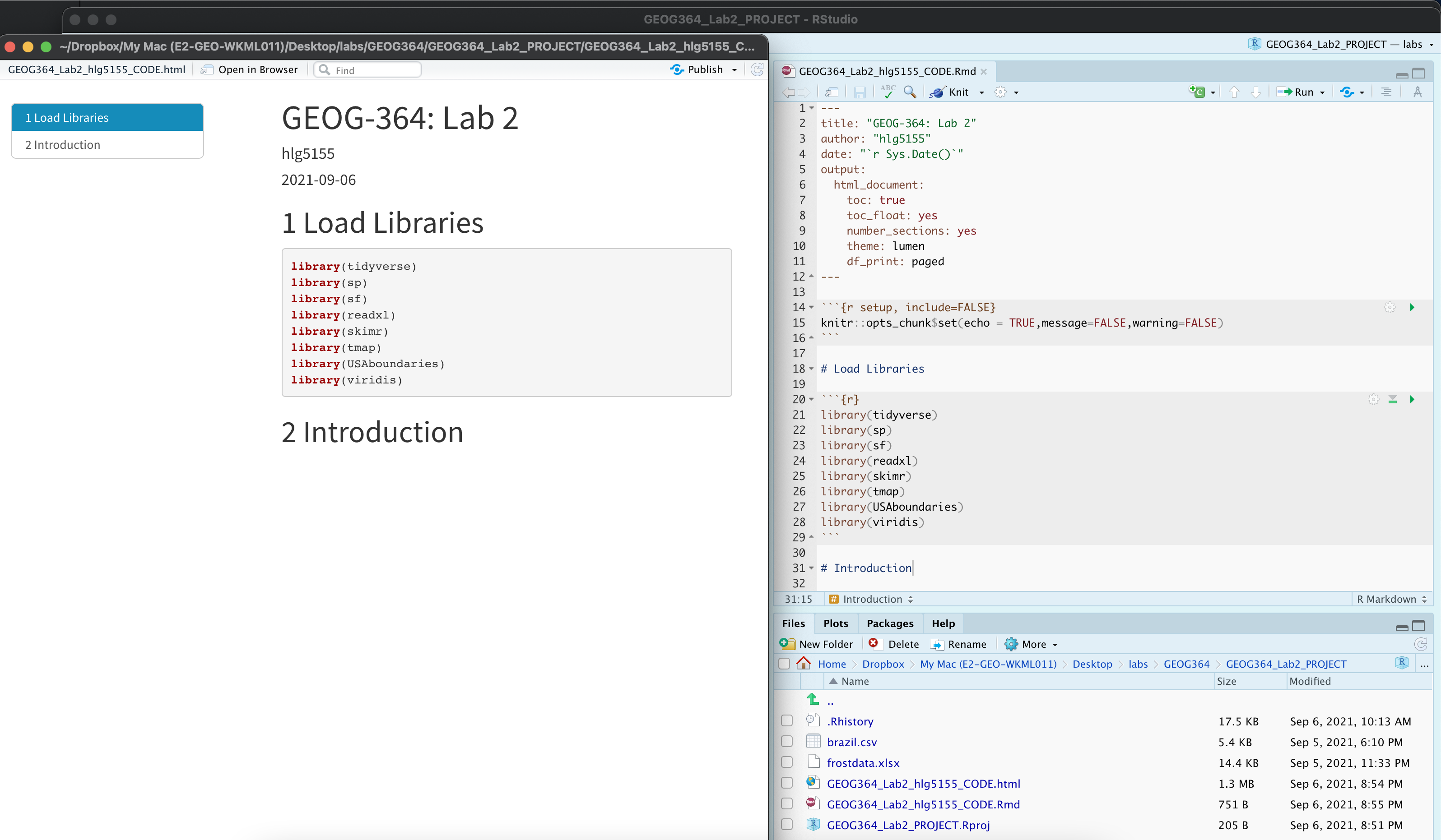
A second way to explore first-order properties is to examine how density varies locally across the study area. One common approach is kernel density estimation (KDE), which produces a continuous surface showing where points are more or less concentrated.
The basic idea is straightforward: imagine sliding a circular window across the map and counting how many points fall inside that window at each location. The result is a smoothed surface, which we can use as our best guess of the true underlying intensity.
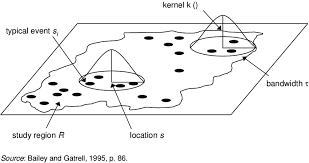
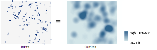
Illustration of a moving kernel window used to estimate local density
- Kernel density using the default bandwidth
Use the code below to calculate a kernel density surface for the schools data using the default bandwidth. Once it works, copy and adapt the code to create a second version for the McDonald’s dataset.
Compare the Schools and McDonald’s maps in your own words. What similarities and differences do you see?
SchoolDensity1 <- density(School.ppp)   # Default bandwidth
plot(SchoolDensity1, main = NULL, las = 1)
contour(SchoolDensity1, add = TRUE)
KDE adjusting the bandwidth
Within KDE, you can decide how big you want your smoothing window to be. The width of this window is controlled by the bandwidth, which determines how coarse or fine the surface will appear.
Different bandwidths tell us different stories about the data. In the example above, the large bandwidth on the left highlights the parts of the city most prone to late-night road accidents but blurs local detail. The small bandwidth on the right reveals specific streets but makes it harder to see the overall pattern.
There is no single “correct” bandwidth. Changing it often reveals different aspects of the underlying process. So we mostly use KDE for EXPLORATORY analysis.
Click here to read more and see some examples in R. https://mgimond.github.io/Spatial/point-pattern-analysis-in-r.html#kernel-density-raster
- Assess how the bandwidth impacts your results.
- Edit your existing KDE code to include the sigma option (as shown
below). For example, if your units are kilometres, sigma = 50 means you
are smoothing over a radius of about 50 km, while sigma = 5 focuses on
patterns at around 5 km.
SchoolDensity <- density(School.ppp, sigma=5)
plot(SchoolDensity, main=NULL, las=1)
contour(SchoolDensity, add=TRUE)
Run the same code several times for both the Schools and McDonald’s data, varying sigma from a very small value (e.g. 1 km) to a very large one (e.g. 1000 km). As you change sigma, think about the real-world processes that might be driving the patterns you see.
For your report, choose a final bandwidth for each dataset (Schools and McDonald’s) that helps you say something interesting about the pattern in relation to New York’s geography or environment. Include the corresponding maps and briefly explain your reasoning below each map.
A* bonus question: Explain how the bandwidth issue links with MAUP’s scale effect.
WEEK 1 COMPLETE
WEEK 2
F. Modelling 2nd order effects
Nearest neighbour analysis
The nearest-neighbour distance measures, for each point in a pattern, how far away its closest other point lies. It captures the local spacing between points and is highly sensitive to whether the pattern is clustered, random, or inhibited. When many points have very small nearest-neighbour distances, this indicates clustering; when distances are consistently large, the pattern shows regularity or repulsion. Under complete spatial randomness (CSR), nearest-neighbour distances follow a known theoretical distribution, so departures from it reveal second-order effects—interactions between points that cannot be explained by intensity alone. For this reason, summary functions based on nearest-neighbour distances, such as the L-function, are widely used to diagnose spatial interaction in point pattern analysis.
There is a NEW READING on the canvas lab page that will help as your guide to this https://psu.instructure.com/courses/2396422/assignments/17585717 You want from the start to the end of section 14.1.
- Calculate & plot nearest neighbours
- The
nndistcommand calculates the distance between each point and its nearest neighbour. Because it’s just calculating a list of numbers, we can add it as a new column to our dataset and treat it like any other column. Here I added it as a new column to both the ppp version of schools and the original dataset.
# Use the nndist command, then save the result as a new column in the schools data
School.ppp$NearestNeighbourDist <- nndist(School.ppp)
Schools$NearestNeighbourDist    <- nndist(School.ppp)
Use the code above to calculate the nearest neighbour distances for the schools data. Once it works, copy and adapt the code to create a second version for the McDonald’s dataset.
For each of your Schools and McDonalds datasets, take the mean of your nearest neighbour column, then use the round command to round it to two decimal places.
Plot a professional looking histogram of the nearest neighbour column of the Schools data and of the McDonalds datasets.
- *By professional, I mean it’s something you would be happy showing
in a job interview (E.g. easy to interpret, correct units, labels
etc..). For code examples, see my STAT-462 tutorial and scroll down for
many different ideas you could tweak: https://psu-spatial.github.io/Stat462-2024/T6_plots.html#histograms-1{.uri
_blank=““}*
Under the histograms, the Schools and McDonald’s nearest neighbour distributions in your own words.
What similarities and differences do you see and how does this link to the underlying processes ‘causing’ schools and McDonalds?
As a hint, your write up should include the words “Schools in Upstate New York, are on average 8.79km apart.” and similar for your McDonalds data.
R.Ratio
We can now calculate the R.Ratio and see if it is unusual compared to a pattern caused by an IRP by using a Clarke Evans test. We will cover this in class on Wednesday, but for now, refer to this reading on Canvas: https://psu.instructure.com/courses/2396422/assignments/17585717 (YOU NEED SECTION 14.1.)
- Explain the R.Ratio
In the text explain what the R Ratio is and what you would expect for:
A very clustered point pattern
Complete spatial randomness
A very uniform/gridded point pattern
Clarke Evans Hypothesis test
Here is the code for a Clarke Evans hypothesis test to check if our observed schools point pattern is EITHER unusually clustered OR unusually regular/gridded, compared to what we would expect if the pattern was generated by an IRP.
It’s also possible to edit this code for a one sided test e.g.
`H1: alternative=“clustered”`: Our observed pattern is unusually clustered compared to a pattern generated by an IRP.
`H1: alternative=“regular”`: Our observed pattern is unusually gridded/regular compared to a pattern generated by an IRP.
A full explanation and write up of the test and its interpretation can be found in the Canvas reading:https://psu.instructure.com/courses/2396422/assignments/17585717 (SECTION 14.1)
- Run your own Clarke-Evans test
Run a Clarke-Evans test to answer this question: “Are schools more regularly spaced (more “gridded”) than we would expect from an Independent Random Process?”
You may choose your own p-value threshold, but you must justify your choice.
I want to see your code and a write up. Your write up must include:
The null hypothesis (H0)
The alternative hypothesis (H1)
The observed test statistic
The test statistic you would expect if H0 were true
The p-value
A clearly stated conclusion
Ripley’s K and the L-Function
What is Ripley’s K?
The problem with nearest-neighbour analysis is that it only captures what happens at the smallest spatial scale: the distance from each point to its closest neighbour. This is useful for detecting very local clustering or repulsion, but it tells us nothing about how points are arranged beyond that first neighbour—whether they form larger clusters, how far apart those clusters sit, or whether there is structure at multiple spatial scales.
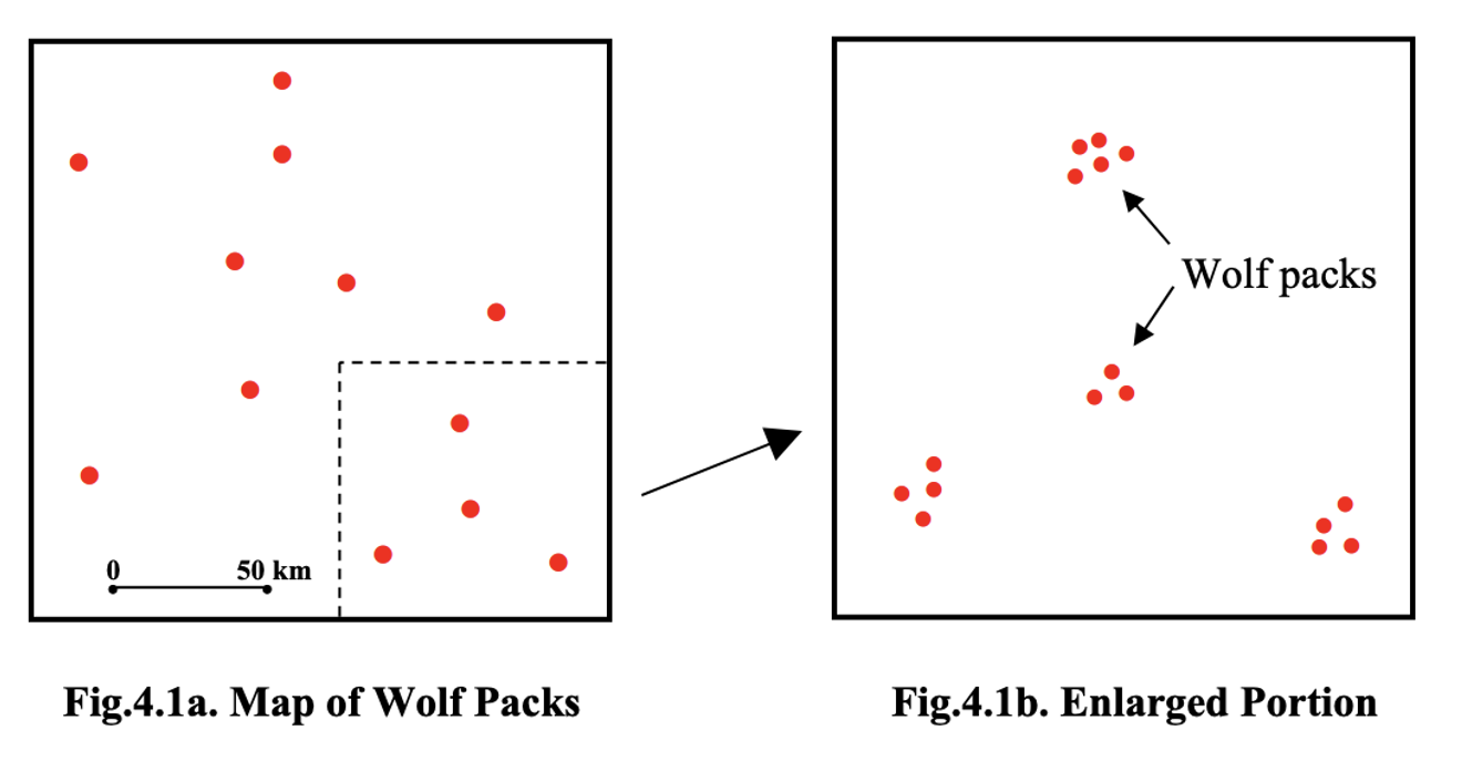
For example, in this common case of wolf packs with small scale uniformity (personal space), but larger scale clustering, nearest neighbour analysis will only show the distance within each cluster.
Ripley’s K and the L function are techniques to help see the entire pattern.
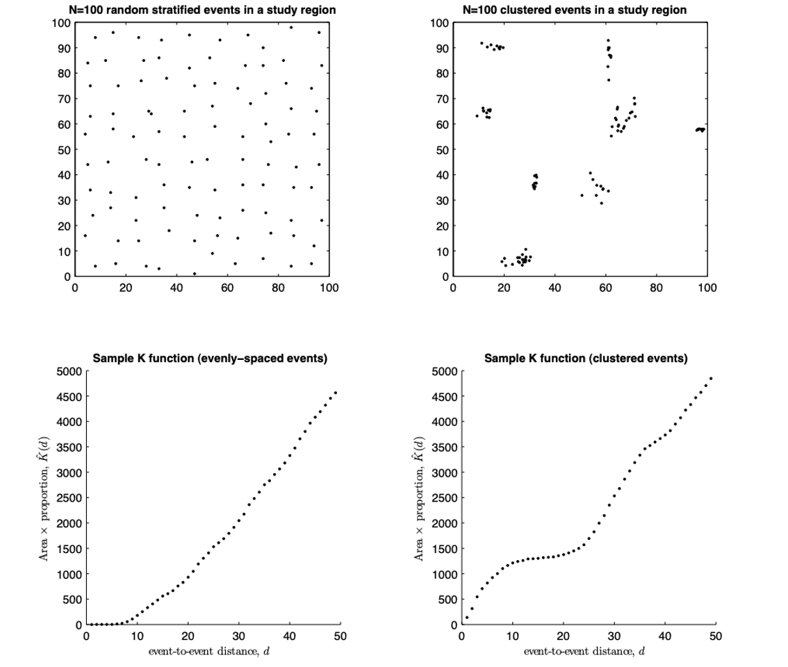
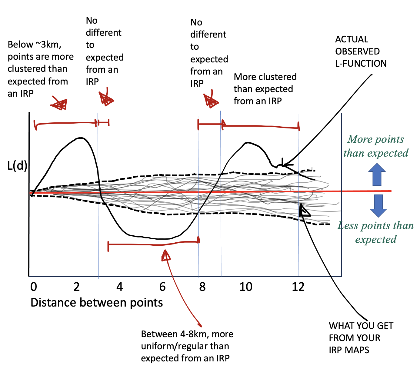
Ripley’s K-function solves this by looking beyond nearest neighbours. Instead of examining only the closest point, K counts all points within a growing radius around each location and averages those counts over the entire pattern. By repeating this for many radii, K reveals how the spatial organisation changes with scale, allowing us to see both the tightness of clusters and the spacing between clusters in a single cumulative plot.
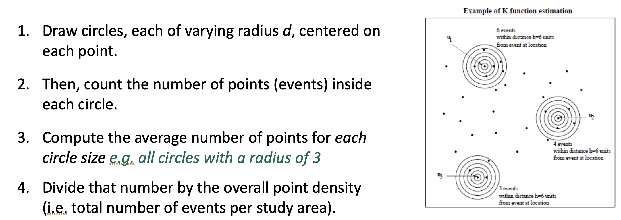
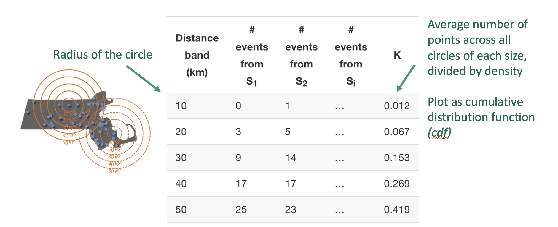
Here’s the result for a few different point patterns. If the line flattens out, it means that there are no neighbours at this distance apart, so there are clusters spaced at that distance apart.
What is the L-Function?
One problem with the K function is that its curve naturally bends upward as distance increases, which makes it hard to see small departures from the expected K under complete spatial randomness.
The L-function is a mathematical rescaling of K that straightens this curve, transforming the expected values for an IRP into a horizontal line. This makes deviations from randomness much easier to interpret. The transformation takes the square root of K divided by π—producing something measured in units of distance—and then compares it directly to r. The resulting plot, L(r) − r, shows clustering as values above zero and inhibition as values below zero, all on a scale that is visually easier to interpret.
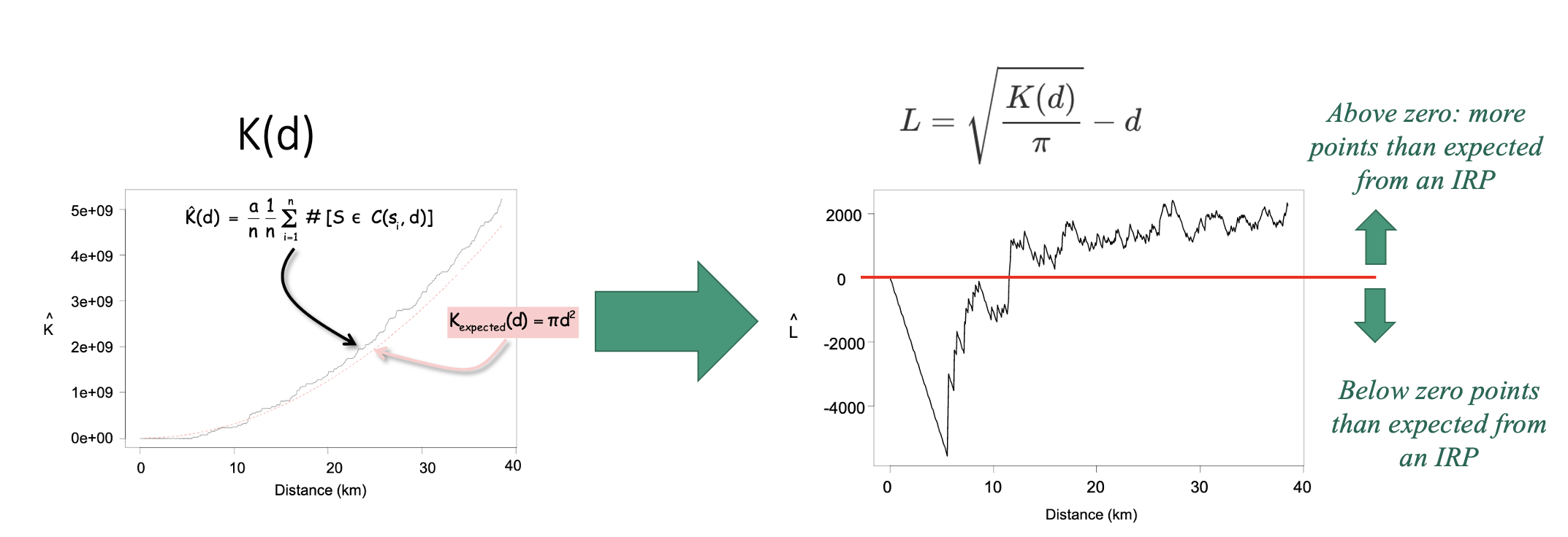
Assessing significance
To decide whether our observed L-function shows real clustering/uniformity or simply random variation, we compare it to what we would expect under complete spatial randomness (e.g. if the pattern was created by an IRP).
We do this using a Monte Carlo envelope. The idea is simple: we generate many random point patterns with the same overall density as our data, compute the L-function for each one, and plot all those simulated curves as faint grey lines. These curves show the range of variation we would naturally expect just by chance. We then take the upper and lower extremes of these simulations to form an ‘envelope’ around the expected line. If the L-function from our real data stays inside this envelope, the pattern is consistent with randomness; if it rises above or below the envelope, it reflects more or fewer neighbouring points than expected, indicating clustering or inhibition at those spatial scales.
Then you can compare YOUR pattern against the ones created by an independent random process.
Running the L function in R
We can use the Lest command to calculate the L-function for our data. For example here is the L function for the schools data without and with edge corrections. I have put some extra packages here to force R to use the, so in this case it’s OK to have them here. 2
library(spatstat.geom)
library(spatstat.explore)

# Compute L with no edge correction
Schools_L_noedge <- Lest(School.ppp, correction="none")

# and L WITH an edge correction
Schools_L <- Lest(School.ppp)


# Make them into a more easily readable format.
Schools_L_noedge.df <- as.data.frame(Schools_L_noedge)
Schools_L.df        <- as.data.frame(Schools_L)

head(Schools_L_noedge.df)
head(Schools_L.df)- Get the L function working in R.
Copy this code over to a new code chunk and get it running. Edit the code chunk options so that warning=FALSE, message=FALSE and results=“hide” (see HW9 for details)
Repeat for the McDonalds Data.
You should see four printouts (2 for schools and 2 for McDonalds). Use this ChatGPT chat (I checked its accuracy) to explain in the text below your code chunk:
- Why edge effects are important
- what each column means and when you might use different techniques
https://chatgpt.com/share/69385657-1db0-800f-8c31-e6d8d12eb32e
- Why edge effects are important
Add in the IRP significance comparison in R
We now run a Monte Carlo envelopes for summary functions of a point pattern. As described above, we do this by:
Simulating many patterns under a null model (here, Complete Spatial Randomness, CSR).
nsimdetermines how many simulations are used.Computing the same statistic for each simulated pattern.
If you want a more realistic envelope, change global to FALSE BUT it will take 5-10mins to run..
# Compute the simulated envelope,
# If you want the simulation envelope to be more accurate set global=FALSE
# BUT it might take 5-10mins to run.
Schools_IRPsim <- envelope(School.ppp, Lest,
                 nsim       = 99,
                 nrank = 1,
                 verbose = FALSE,
                 correction = "translate",
                 global     = TRUE)

Schools_IRPsim.df   <- as.data.frame(Schools_IRPsim)
head(Schools_IRPsim.df)
Here you will see:
rthe distance between points e.g. the size of the circleobsthe average of all the simulated runstheotheoretically what you should expectlothe lowest value of the grey cloudhithe top value of the grey cloud
- Get the Monte Carlo function working in R.
Copy this code over to a new code chunk and get it running. Edit the code chunk options so that warning=FALSE, message=FALSE and results=“hide” (see HW9 for details)
Repeat for the McDonalds Data.
- One final transformatino
- To make the results even easier to read, we can subtract the distance at each point (this is what makes it flat). This is the code for the Schools data. Add a new code chunk and check it works (nothing should happen but no errors)
# And correct so that instead of a straight line with slope 1, we look at a flat line with slope 0,m because its easier to interpret.

Schools_L_noedge.df <- Schools_L.df %>%
  mutate(
    none_minus_r  = trans  - r
  )

Schools_L.df <- Schools_L.df %>%
  mutate(
    iso_minus_r    = iso    - r,
    trans_minus_r  = trans  - r,
    theo_minus_r   = theo   - r
  )

Schools_IRPsim.df <- Schools_IRPsim.df %>% mutate(
    obs_minus_r = obs - r,
    lo_minus_r  = lo  - r,
    hi_minus_r  = hi  - r
)- Repeat for the McDonalds Data.
- Visualising the outcome
- Finally we can make a plot! This code looks complicated but really
it’s just a load of layers on top of each other. There is a built-in
plot,but it’s very hard to read.
- Get this running in your code. (note the translation edge effect might be hidden)
#--------------------------------------------
# First sort out your y limits
#--------------------------------------------
max_y <- max(
  abs(Schools_L_noedge.df$none_minus_r),
  abs(Schools_L.df$iso_minus_r),
  abs(Schools_L.df$trans_minus_r),
  abs(Schools_IRPsim.df$lo_minus_r),
  abs(Schools_IRPsim.df$hi_minus_r)
)
ylims <- c(-max_y, max_y)


#--------------------------------------------
# Then plot
#--------------------------------------------
ggplot() +
  # envelope shading
  geom_ribbon(
    data = Schools_IRPsim.df,
    aes(x = r, ymin = lo_minus_r, ymax = hi_minus_r),
    fill = "grey85"
  ) +

  # No correction
  geom_line(
    data = Schools_L_noedge.df,
    aes(x = r, y = none_minus_r, colour = "No edge correction"),
    linewidth = 0.5,
  ) +

  # iso correction
  geom_line(
    data = Schools_L.df,
    aes(x = r, y = iso_minus_r, colour = "Ripley's correction"),
    linewidth = 0.5, linetype = "dashed"
  ) +

  # translation correction
  geom_line(
    data = Schools_L.df,
    aes(x = r, y = trans_minus_r, colour = "Translation correction"),
    linewidth = 0.5, linetype = "dotted"
  ) +

  # CSR theoretical line (L(r) = r → L(r)-r = 0)
  geom_line(
    data = Schools_L.df,
    aes(x = r, y = theo_minus_r, colour = "Expected if IRP"),
    linewidth = 0.5) +

  scale_colour_manual(
    name = "Edge correction method",
    values = c(
      "No edge correction"         = "black",
      "Ripley's correction"         = "blue",
      "Translation correction" = "firebrick",
      "Expected if IRP" = "steelblue"
    )
  ) +

  labs(
    x = "Distance between schools (km)",
    y = "L(r) - r",
    title = "L-function for NY Schools with edge correction methods"
  ) +
  coord_cartesian(xlim = c(0, 50), ylim = ylims)+
  theme_bw(base_size = 12) +
theme(legend.position = "right")- CAREFULLY repeat for the McDonalds Data.
- Interpret the output
Now you should have your two L-function plots. Interpret what they both mean in terms of schools and McDonalds.
Is the data unusually clustered, uniform or no-different-to-IRP data at different distances?
How does correcting for edge effects change your results?
Does each show the story you are expecting? Is there anything that might be skewing your results (hint, its a link to 1st order autocorrelation).
- Interpret the p-value
Your p-value for the L-function envelope is directly linked to nsim, the number of IRP simulations you generated. The smallest p-value you can detect is approximately 1/nsim. For example, with nsim = 100, the smallest possible p-value is about 0.01; with nsim = 5, it is about 0.2.
Reduce nsim in your Monte Carlo envelope code to a very small number (e.g. nsim = 5), re-run the code from that point to the end so that your plot updates, and then explain in your write up:
What changes happen to the appearance of the grey Monte Carlo envelope (the “cloud”)?
What does this tell you about the relationship between nsim and the strength of evidence you can claim about clustering or inhibition?
G. Reflection
Going much further beyond this point will lead us to masters level work, as to control for things like population density we would need to fit generalised point pattern regression models. So instead:
- Write a short reflection on the data,
This should connect what you learned across Weeks 1 and 2. Your reflection should address the following with a few sentences for each point.
What is pattern of McDonalds and Schools across upstate New York, and potential causes?
Does the locational fallacy impact either dataset and why?
Do edge effects impact either dataset and why?
How did the distinction between first-order effects (e.g. varying population density, geography, or settlement patterns) and second-order effects (interactions between points) shape your interpretation of the Schools and McDonald’s datasets?
In what ways did the kernel density maps and nearest-neighbour analysis give different kinds of information about the spatial pattern?
If you were investigating the autocorrelation pattern of Schools vs McDonalds for your job, what would be the next thing you want to look at?
CONGRATS! FINISHED!
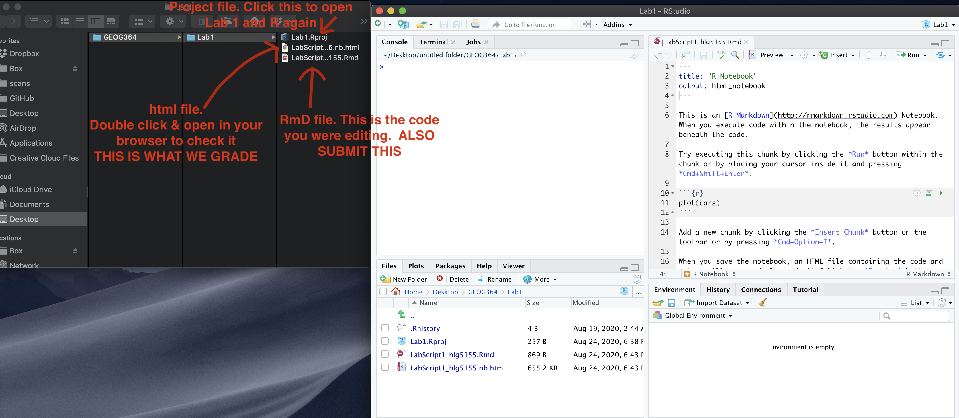
Submitting your Lab
Remember to save your work throughout and to spell check your writing (next to the save button). Now, press the knit button again. If you have not made any mistakes in the code then R should create a html file in your lab3 folder, complete with a very recent time-stamp.
If you are on posit cloud:
You can download each of your .RmD and html files by:
- Clicking on the little box next to the Rmd in the Files tab, then
going to the little blue cogwheel (might need to make your Rstudio full
screen) and clicking export.

Repeat the process exactly for the html file underneath it (e,g, just have the html clicked.)
Now go to Canvas and submit BOTH your html and your .Rmd file in Lab 7.
Posit desktop
Go to your Lab 7 folder, In that folder, double click on the html file. This will open it in your browser. CHECK THAT THIS IS WHAT YOU WANT TO SUBMIT
Now go to Canvas and submit BOTH your html and your .Rmd file in Lab 7.
GRADING RUBRIC
Submitting files (15 pts)
- 15 pts: Both Rmd and HTML submitted; knit successful.
- 10 pts: Only one file submitted or minor knit issues.
- 0 pts: Nothing submitted or cannot knit.
General style and organisation (10 pts)
- 10 pts: Well-organised; headings used; clean output; YAML correct.
- 8 pts: Minor clarity or formatting issues; occasional unnecessary output.
- 5 pts: Many issues; output cluttered; hard to follow; repeated warnings.
- 0 pts: No usable code.
Writing quality (10 pts)
- 10 pts: Clear explanations in full sentences; units included; code and results interpreted.
- 8 pts: Mostly clear but missing some explanations or units.
- 5 pts: Minimal or unclear writing; difficult to understand what was done.
- 0 pts: No meaningful writing.
Introduction and spatstat explanation (10 pts)
- 10 pts: Correct explanation of point-pattern analysis; link to external resource; 50+ word description of spatstat with useful details.
- 8 pts: Mostly correct but missing nuance or some required detail.
- 6 pts: Partial attempt; some key elements missing (e.g. link or spatstat description).
- 0 pts: No attempt.
Mapping, initial data exploration, and CRS explanation (20 pts)
- 20 pts: Maps for Schools and McDonalds work; clear styling; thoughtful comparison of spatial patterns and autocorrelation at multiple scales; clear explanation of first- vs second-order processes; correct discussion of locational fallacy, non-uniformity of space, and MAUP; CRS and units correctly identified and explained.
- 17 pts: Maps and discussion mostly correct but missing some nuance or incomplete CRS explanation.
- 14 pts: Maps included but interpretation shallow or incomplete; spatial issues only briefly mentioned.
- 10 pts: Basic maps shown but minimal interpretation; CRS vague or partly incorrect.
- 0 pts: No attempt.
Converting data to spatstat objects (10 pts)
- 10 pts: Correct creation of owin window; successful conversion to ppp for both datasets; margin-controlled plots; rescaling to km completed.
- 8 pts: Mostly correct but missing one element (e.g. window explanation or rescaling).
- 6 pts: Code runs but results incomplete or unclear (e.g. only one dataset converted).
- 3 pts: Attempt with major gaps or errors.
- 0 pts: No marks.
First-order analysis: Global and local density (15 pts)
- 15 pts: Clear explanation of intensity vs density; correct global density for both datasets with interpretation; KDE maps for both datasets; comparison of patterns; bandwidth exploration; justified final sigma choice; MAUP-bandwidth link noted if attempted.
- 13 pts: Good attempt but missing conceptual depth or bandwidth justification.
- 11 pts: Calculations present but interpretation shallow or incomplete.
- 8 pts: Minimal attempt; major conceptual gaps or incorrect interpretation.
- 0 pts: No marks.
Nearest-neighbour analysis (10 pts)
- 10 pts: nndist computed for both datasets; mean distances rounded; professional histograms (labels, units, readable axes); clear comparison of nearest-neighbour distributions and underlying processes.
- 8 pts: Minor issues with interpretation or plot clarity (e.g. missing units or labels).
- 6 pts: Code works but write-up limited or vague.
- 3 pts: Attempt but several components missing (e.g. only one dataset, no histograms).
- 0 pts: No marks.
R-Ratio and Clarke–Evans test (15 pts)
- 15 pts: Clear explanation of what the R-ratio indicates for clustered, CSR, and regular patterns; Clarke–Evans test runs successfully; write-up includes H0, H1, observed statistic, expected value under H0, p-value, chosen significance level, and a correct conclusion stated in context.
- 12 pts: Minor missing elements or limited justification of the chosen significance level.
- 9 pts: Code runs but interpretation incomplete or partially incorrect.
- 5 pts: Attempt but missing several key components (e.g. hypotheses or conclusion).
- 0 pts: No marks.
L-function, simulation envelope, and nsim interpretation (20 pts)
- 20 pts: L-function computed for both datasets with and without edge correction; explanation of why edge effects matter; columns (r, iso, trans, theo) correctly interpreted; Monte Carlo envelope computed; transformation to L(r) - r carried out; ggplot with envelope and curves is clear and labelled; interpretation of clustering or inhibition at different distances; clear explanation of how reducing nsim changes the envelope and limits the smallest detectable p-value.
- 17 pts: Mostly correct but with minor coding issues or shallow interpretation of edge effects or nsim.
- 14 pts: Code runs but plots are hard to read or interpretation limited to a few general statements.
- 8 pts: Attempt but missing key steps (e.g. no transformation, no nsim discussion, or only one dataset).
- 0 pts: No marks.
Final reflection (10 pts)
- 10 pts: Thoughtful reflection addressing all required points (patterns and causes for Schools and McDonalds; locational fallacy; edge effects; role of first- vs second-order effects; how KDE and nearest-neighbour analysis gave different information; a clear next step if this were a job task).
- 8 pts: Clear but missing depth on one or two of the required points.
- 5 pts: Very brief or incomplete reflection; only some bullets addressed.
- 0 pts: No marks.
Overall
Overall, here is what your lab should correspond to:
| Grade | % Mark | Rubric |
|---|---|---|
| A* | 98-100 | Exceptional. Not only was it near perfect, but the graders learned something. THIS IS HARD TO GET. |
| NA | 96+ | You went above and beyond |
| A | 93+: | Everything asked for with high quality. Class example |
| A- | 90+ | The odd minor mistake, All code done but not written up in full sentences etc. A little less care |
| B+ | 87+ | More minor mistakes. Things like missing units, getting the odd question wrong, no workings shown |
| B | 83+ | Solid work but the odd larger mistake or missing answer. Completely misinterpreted something, that type of thing |
| B- | 80+ | Starting to miss entire/questions sections, or multiple larger mistakes. Still a solid attempt. |
| C+ | 77+ | You made a good effort and did some things well, but there were a lot of problems. (e.g. you wrote up the text well, but messed up the code) |
| C | 70+ | It’s clear you tried and learned something. Just attending labs will get you this much as we can help you get to this stage |
| D | 60+ | You attempt the lab and submit something. Not clear you put in much effort or you had real issues |
| F | 0+ | Didn’t submit, or incredibly limited attempt. |
And.. finished!