Lab 4: Voronoi Polygons & Ozone pollution
One week lab!
One week lab!
1. Overview
Welcome to Lab 4. The objective of this lab is to
introduce you to the concept of Voronoi polygons and demonstrate their
practical application in designing an air quality monitoring network for
California. You will learn how to create Voronoi polygons from ozone
measurement data, identify suitable monitoring station locations, and
explore the significance of such a network in air quality management.
You will also compare this with spatial demographic data from the
CDC/ATSDR Social Vulnerability Index.
See the rubric on canvas (this is up!) for how it will be graded and
the checklist at the end for what you need for 100%.
See The Canvas page here, or go to canvas for assignment guidelines.
You can use either the website base RStudio/Posit Cloud OR R-Desktop for
this lab.
This is a ONE WEEK LAB.
2. Background (please read!)
A. Ozone pollution
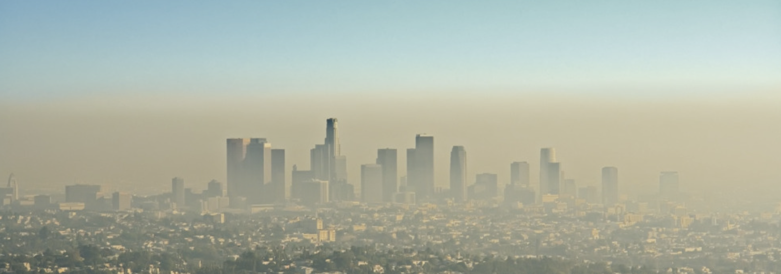
As the global population and city sizes increase, it is increasingly
important to understand atmospheric air pollution. Two major pollutants
include Ozone (O3) and particulates (PM 2.5). In this lab, we will map
them and explore their impact on populations in California.
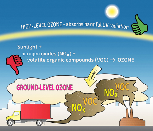
Ozone is a naturally occurring molecule made up of three Oxygen
atoms. 90% of the plant’s ozone exists in the “ozone layer”, which
exists approximately 20-25km above sea level, in the stratosphere.
Stratospheric ozone is crucial for human life, as it absorbs damaging
solar ultra-violet radiation (see the “ozone hole” for the importance of
natural ozone).
10% of the planet’s ozone is found in the lowest levels of the
atmosphere, in the air which we breathe. It is created when pollutants
such as NOx and VOCs (emitted by cars and industry) react with sunlight.
Strong evidence exists that the risk of premature death increases with
higher levels of ozone. High levels of ozone can cause immediate health
problems such as asthma. Over the longer term, ozone exposure can
exacerbate pre-existing lung and heart health problems. Read more here:
https://aircentraltexas.org/en/regional-air-quality/who-is-at-risk
It is important to map the spread of ozone to support public health policy. We have access to a point dataset of ozone data, showing the location of the monitoring network. We also have access to demographic data from the US census and their Social Vulnerability Index. We will use Voronoi polygons to assess the intersection between these and the impact on environmental justice.
B. Voronoi Polygons
What are they?
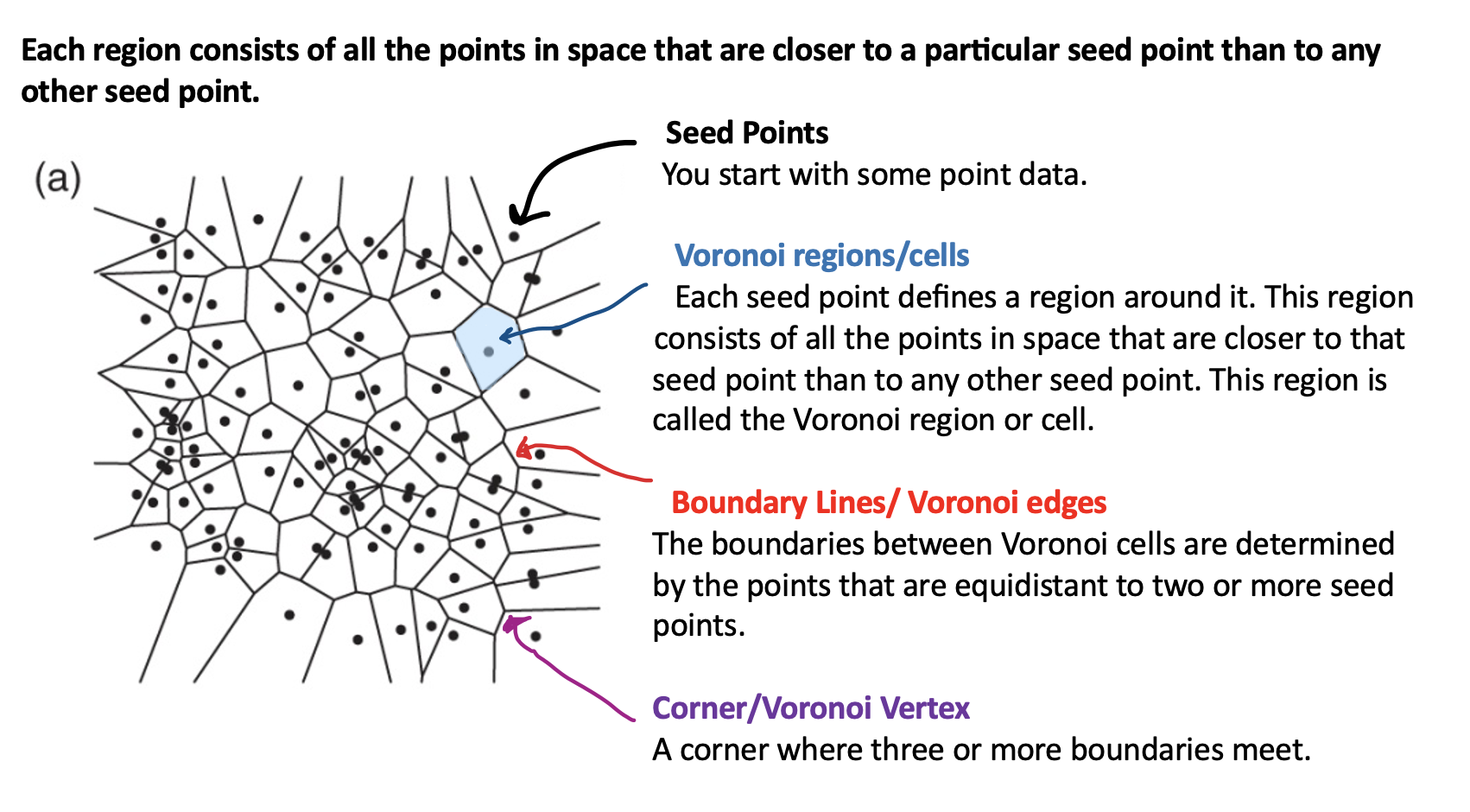
Read these two articles on voronoi polygons to understand more:
- https://fbellelli.com/posts/2021-07-08-the-fascinating-world-of-voronoi-diagrams/
- https://gisgeography.com/voronoi-diagram-thiessen-polygons/
Here is how they might be useful in our case:
Air Quality Monitoring Network Design:
When setting up or optimizing an air quality monitoring network, Voronoi polygons can help determine the optimal locations for monitoring stations. Each monitoring station can be located at the centroid of its corresponding Voronoi polygon, ensuring that the network covers the entire area efficiently.
Environmental Justice Studies:
Voronoi polygons can be utilized in environmental justice studies to assess whether certain communities, particularly those with vulnerable populations, are disproportionately affected by high ozone levels. AND if those communities have a dense enough monitoring network. Understanding ozone concentration patterns can contribute to health risk assessments. By overlaying Voronoi polygons with demographic data, you can assess the exposure of different populations to high ozone levels, potentially leading to health warnings or policy recommendations.
Identifying Ozone Hotspots:
Voronoi polygons can help identify areas with high ozone concentrations, known as “ozone hotspots.” By visualizing the Voronoi polygons, you can quickly pinpoint regions where ozone levels are consistently elevated. This information is crucial for understanding air quality and targeting pollution control efforts. Not the best way but fast
Pollution Source Identification:
Voronoi diagrams can assist in identifying potential sources of ozone pollution. High ozone concentrations in a specific Voronoi polygon could indicate nearby pollution sources that need further investigation. This can be valuable for regulatory agencies and environmental scientists. Not the best way but fast
Data Validation and Quality Control:
Voronoi diagrams can be used to validate and control the quality of ozone measurement data. Outliers or inconsistencies in data within a Voronoi polygon may indicate measurement errors or the need for further investigation.
3. Data (please read!)
A. Ozone Data
Ozone measurements were taken across the State of California. Population density has also been recorded at each site using this source: https://sedac.ciesin.columbia.edu/data/set/gpw-v4-population-density-rev11.
- The units of the ozone measurements are in “1000 parts per billion”.
- The units of population density are people per square km.
B. SOVI Social Vulnerability Index
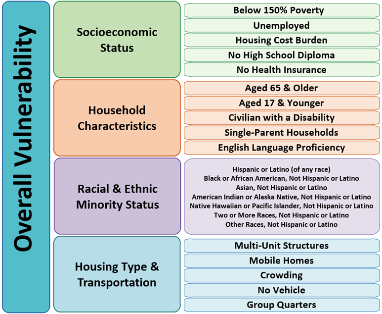
SOVI, or the Social Vulnerability Index, is a quantitative measure used to assess the resilience and susceptibility of communities to various hazards and disasters, such as natural disasters or public health crises. It considers factors like socioeconomic status, access to resources, and community infrastructure to determine the level of vulnerability within a given population. It is based on US-Census data, so we have variables as vector POLYGONS (either census tracts or counties). There are many places to access and download the data.
Read more here: https://sc.edu/study/colleges_schools/artsandsciences/centers_and_institutes/hvri/data_and_resources/sovi/index.php
Here’s the SOVI “recipe” https://sc.edu/study/colleges_schools/artsandsciences/centers_and_institutes/hvri/documents/sovi/sovi_recipe_2016.pdf
You can see what individual column names mean here.
I suggest using Edit/Find or Ctrl-F to quickly search for what you need https://www.atsdr.cdc.gov/placeandhealth/svi/documentation/pdf/SVI2020Documentation_08.05.22.pdf
4. Getting started.
To make it easier for a one week lab, I have provided much of the code and data. FIRST, GO BACK AND READ THE BACKGROUND ABOVE.
A. Create your project
In Desktop R, select your 364 directory, create a new project, then name the project Lab 3. If you are stuck on this process, see these tutorials
For R-Desktop, see Tutorial 3B
For Posit Cloud, see Tutorial 3C
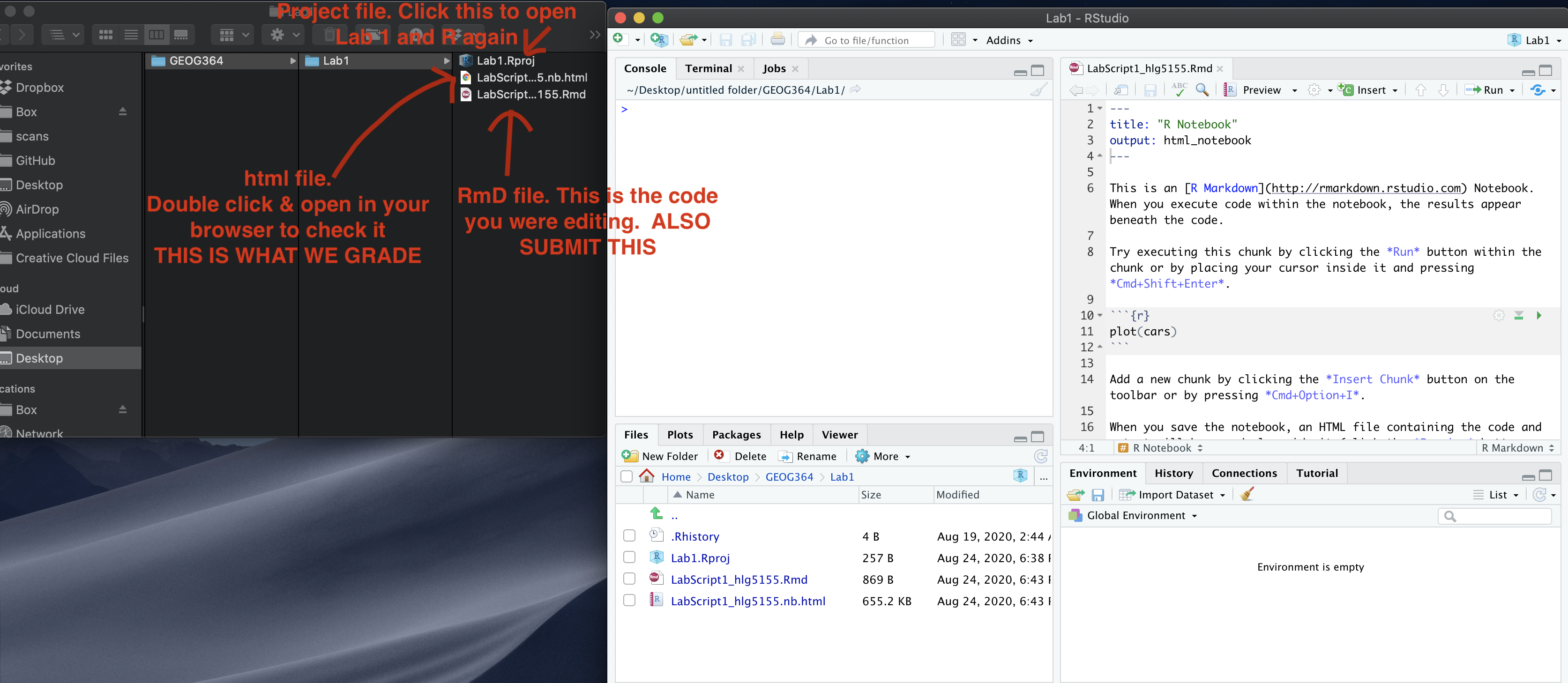
You can check this has worked by looking on the file explorer on your
computer, then selecting your GEOG364 folder and checking that a Lab 4
folder has appeared with your .Proj file inside it. This is
what you double click to access this lab in R.
B. Get the lab script and data
Go to CANVAS LAB 4, download the lab report template and the ozone dataset. Rename the lab report to include your email ID and place in your Lab 4 folder.
5. Your analysis
Open your lab script and follow the instructions. Most of the code chunks will run automatically. Some, I might ask you to edit.
6. Submitting your work
Remember to save your work throughout and to spell check! (next to the save button). Now, press the knit button one final time.
On R-Desktop
If you have not made any mistakes in the code then R should create a html file in your lab 4 folder which includes your answers.
If you look at your lab 4 folder on your computer, you should see the html there - complete with a very recent time-stamp. Double click on the html file. This will open it in your web-browser.
CHECK THAT THIS IS WHAT YOU WANT TO SUBMIT.
On Rstudio cloud,
- See TUTORIAL
3 Cloud - LINK FIXED for how to download your files
Finally, go to Canvas and submit BOTH your html and your .Rmd file in Lab 3.
How am I graded?
Overall, here is what your lab should correspond to:
| POINTS | Approx grade | What it means |
|---|---|---|
| 98-100 | A* | Exceptional. Above and beyond. THIS IS HARD TO GET. |
| 93-98 | A | Everything asked for with high quality. Class example |
| 85-93 | B+/A- | Solid work but the odd mistake or missing answer in either the code or interpretation |
| 70-85 | B-/B | Starting to miss entire/questions sections, or multiple larger mistakes. Still a solid attempt. |
| 60-70 | C/C+ | It’s clear you tried and learned something. Just attending labs will get you this much as we can help you get to this stage |
| 40-60 | D | You submit a single word AND have reached out to Dr G or Aish for help before the deadline (make sure to comment you did this so we can check) |
| 30-40 | F | You submit a single word……. ANYTHING.. Think, that’s 30-40 marks towards your total…. |
| 0+ | F | Didn’t submit, or incredibly limited attempt. |