Chapter 4 Lab 3
4.1 Lab 3 General information
Welcome to STAT-462 lab 3. The aim of this week is to:
- A little more markdown (code chunks)
- Read a variety of data into R-Studio
- Make some scatter plots
- Explore correlation plots and statistics
General comments
You do not have to submit things you try from the tutorials, you will just be graded on the lab 3 assignment.
There is also a canvas discussion board for this lab which will be the fastest place to get an answer. https://psu.instructure.com/courses/2115020/discussion_topics/13706470
Lab 3 Tutorials
This lab contains questions on markdown formats, hypothesis test and on exploratory data analysis. I encourage you to go and look at the tutorials as needed. All the answers are in there (for a different dataset).
4.2 Installing new packages
Please install the tmap, sf, plotly and readXl packages.
You can either use the install.packages() command in the console, OR
Click on the packages tab, between plots and help on the bottom quadrant of your screen.
The list of packages you see are the ones currently downloaded on your computer, so CLICK THE INSTALL BUTTON.
Start typing the package name and click install.
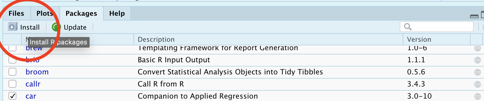
Figure 4.1: How to manually install a package
4.3 Lab 3 Setup & Markdown
Save all your work and if you haven’t already, create a Lab 3 folder in your STAT-462 folder
Create a new R-project called Lab 3 that is linked to your Lab 3 folder (instructions in section 1.2, “Lab Challenge 1”). It will probably open a new version of R-Studio.
Create a new Markdown file called “username_Lab3” (for me it will be hlg5155_Lab3)
Remove the “friendly text” (see Tutorial 1E, section 1.5.3 if you have no idea what I mean)
Follow the instructions to edit your YAML code to look like my example in Section 1.7.1. (tutorial 2B). Choose any theme that you like.
Leave a blank line under your YAML code, then create a level-1 Heading called “Markdown”. Save and make sure that it will preview/knit.
Make a new code chunk. Inside here, you can add all the libraries you need (if you do not have them, you can install them using the tutorial from last week). Start by entering these, but if you need any more packages you can add them here and rerun the code chunk. Run the code chunk a few times to make sure they load with no errors.
# Load libraries
library(tidyverse)
library(dplyr)
library(ggpubr)
library(Stat2Data)
library(corrplot)
library(olsrr)
library(sf)     # you have to have installed this first..
library(tmap)   # you have to have installed this first..
library(readxl) # you have to have installed this first..
library(plotly) # you have to have installed this first..
Edit the “code chunk code” at the top of the code chunk so that the code is run and it is shown, but none of the warnings or messages show up (e.g. none of the the friendly text is shown).
Choose any picture/screenshot that you like (of anything at all).
Add this into your report, but edit the “code-chunk code” so that I see the image in your report, but I do not see the code you used to create the output. Add a caption to tell me about the picture you choose using the fig.cap argument (Tutorial 3A)
4.4 Regression basics
- Leave a blank line under your YAML code, then create a level-1 Heading called “Regression basics”. Save and make sure that it will preview/knit. For the questions below, using sub-headings for each question makes it 100 times easier to grade (please do!)
First use the code below to load the dataset TextPrices from the Stat2Data package. Remember that you will have to load the package by running the “library” code chunk before anything will work.
# This will only work after running library(Stat2Data) from your 1st code chunk
data(TextPrices)
View(TextPrices) # opens data in a new tab
Describe the dataset, using the commands you learned in Labs 1 and 2, along with the help file: (
?TextPrices). How much data is there? What are the columns describing? Summarise each variableDecide on a response variable for this dataset and justify your decision
Decide on a predictor variable for this dataset and justify your decision
Create a professional scatterplot. We can create a basic scatterplot using:
Make your plot look more professional than this (do not use ggplot2, this is to teach “base R”). Give the plot better axis titles, change the point type and color and add anything else you would like.
These tutorials should help you answer this question - https://www.r-graph-gallery.com/13-scatter-plot.html - https://www.datanovia.com/en/blog/pch-in-r-best-tips/
In the text below the code chunk, fully describe the scatterplot and study in the way I discussed in Lecture 7.
Now use Tutorial 3B to make a regression model with Price as your response variable (no matter what you answered earlier).
Write the equation for the regression model (e.g \(\widehat{y} = b_{0}+b_{1}x\) , remembering to reference units with your answer).
According to your model, how much does the price go up for every 50 pages added to the textbook?
Make a new code chunk, then copy/paste your scatterplot code. Add the regression model (e.g. the line of best fit), using Tutorial 3B to help.
4.5 Taiwan housing challenge.
Create a new Level 1 heading called House Prices.
Next month, your friend is moving to Sindian Dist., in New Taipei City, Taiwan. They want to buy a house and have asked you to figure out what most impacts house price.
- Download the “Lab03_house.xlsx” dataset from the Lab page on canvas and put it into your Lab 3 folder. Use the read_excel() command to read it in and save it to a variable called house:
# This only works if you are running your project
# If it can't find the file, use file.choose() to locate it, as described in homework 3
# Then add in the full location rather than just the file name.
house <- read_excel("Lab03_house.xlsx")
Explore the dataset (using summaries etc (lab 1 & 2), and by reading more about the data here: https://archive.ics.uci.edu/ml/datasets/Real+estate+valuation+data+set). Describe the dataset to your friend. What columns does the dataset contains and how much data there is? Are there any limitations using this data?
Use R to explore the summary statistics and distribution of the House.Price column. What range of costs are “most” of the prices between? (say 68% or the interquartile range..) Is the house price data normally distributed?
You have a been told that houses might be more expensive in the North.
_ Choose your response and your predictor
- Create a scatterplot to assess this (hint: Latitude is the North/South coordinate).
- Describe the scatterplot fully as discussed in Lecture 7.
- Create a Simple Linear Regression model to assess the issue
- Plot the abline, line of best fit onto a new scatterplot
- Create a scatterplot to assess this (hint: Latitude is the North/South coordinate).
Why might this be misleading as an analysis? or why might this model be flawed? What confounding variable could there be? To help you answer this question, try running this code to further explore the data on a map.
# Command from the sf library
# Make a spatial version of the data using the Longitide and Latitude columns
house.spatial <- st_as_sf(house,coords=c("Longitude","Latitude"),crs = 4326)

# make interactive, for static set as "plot"
tmap_mode("view")


# Command from the tmap library
# and plot
tm_basemap("Esri.WorldTopoMap") +
     qtm(house.spatial, # data
         symbols.col="House.Price", # which column for the symbols
         symbols.alpha=0.9, # transparency
         symbols.size=.2, # how big
         symbols.palette="Spectral", #colors from https://colorbrewer2.org
symbols.style="fisher") # color breaks- What other confounding variables are there? Is there a variable that is more important than latitude in predicting house prices? Provide evidence to justify your answer. To help you answer this data and answer this question, some useful code includes:
- [A] corrplot(). A quick look at the correlation coefficient between all the variables. We will discuss it more next week.
- [B] If you then want to look at three variables together, you can use an interactive plot e.g you can use this code and change the response, y (currently house price), the predictor x (currently latitude) and the colour (currently distance from the metro station). Have a play and see what variables stand out.
# Create a plot
p <- house %>%
  ggplot( aes(Latitude,House.Price, col= House.Age)) +
  geom_point() +
  theme_classic()+
  scale_color_gradient(low="blue", high="red")

# and actually plot it
ggplotly(p)- You can also use standard scatterplots and regression models if that is easier. Or even excel and screenshots embedded in your report if it is all going wrong!
Your friend forgot to tell you that they love shopping. They only want to live in a house that is close to at least 7 shops, but are worried that they might end up paying too much.
- Filter the data so that it only includes 7 or more nearby shops e.g you’re subsetting by the number of shops column (Tutorial 2C, section 1.8.6). Save the output to a new variable called
house.gt7shop.
- Run a t.test to find out if your house.gt7shop data has a mean that is significantly higher than the mean of the house prices over the whole region (Tutorial 2D, 1.9.2). Remember to write up your hypotheses, the results and the conclusion in plain English that your friend would understand.
- Filter the data so that it only includes 7 or more nearby shops e.g you’re subsetting by the number of shops column (Tutorial 2C, section 1.8.6). Save the output to a new variable called
[OPTIONAL BONUS 2%] How much does the house price go up for every 1 KILOMETER that you travel away from a metro station? Hint(remember the lm command..)
4.6 Submitting Lab 3
Remember to save your work throughout and to spell check your writing (next to the save button). Now, press the knit button again. If you have not made any mistakes in the code then R should create a new html file which includes your answers. This can be found in your Lab 3 folder and have a .html ending.
Check your html is complete by double clicking on to open it in your web-browser.
Now go to Canvas and submit BOTH your html and your .Rmd file in Lab 3. (see the end of lab 1 for a screenshot)
4.6.1 Lab 3 submission check
HTML FILE SUBMISSION - 5 marks
RMD CODE SUBMISSION - 5 marks
MARKDOWN/CODE STYLE - 5 MARKS
LOOK AT YOUR HTML FILE IN YOUR WEB-BROWSER BEFORE YOU SUBMIT. You included the headings/sub-headings as requested. Your code and document is neat and easy to read. There is also a spell check next to the save button.
WRITING STYLE - 5 marks
You have written your answers below the relevant code chunk in full sentences in a way that is easy to find and grade. You included a figure caption (not just writing a sentence under your plot)
REGRESSION BASICS
Describe the dataset, & choose/justify response & predictors - 5 marks
Create a professional scatterplot including all requested elements - 5 marks
Fully describe the scatterplot in clear langauge including all requested elements - 10 marks
Correctly create the regression model, interpret the regression equation and add the line of best fit - 15 marks
TAIWAN DATA
Describe the dataset - 5 marks
Describe house price column - 5 marks
Correctly follow regression analysis including all requested elements - 10 marks
Comment on confounding variables & why this might be misleading - 10 marks
Provide evidence to show a better variable that predicts house price - 10 marks
T.Test question - 5 marks
[100 marks total]